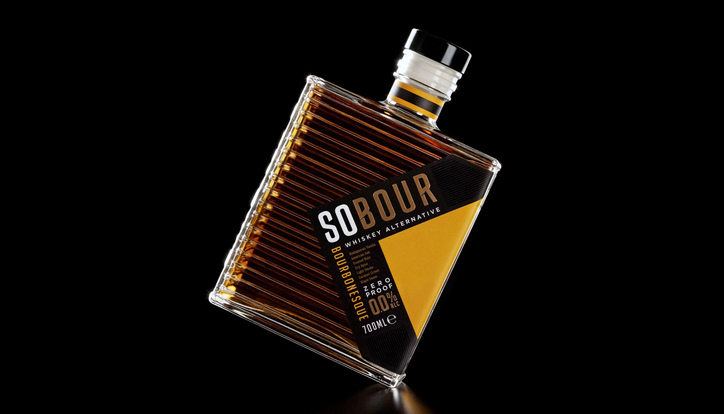
Sobour Non-alcoholic Whiskey alternative
Bespoke brand and bottle design for non-alcoholic whiskey alternative range.
CLIENT BASED: UKThe brief for Sobour required the creation of a non-alcoholic American whiskey brand that was modern and avoided the some of the more common bourbon tropes.
The client required the concepts to have a disruptive appearance, to mark a move away from traditional alcoholic choices, a chance to think and drink differently while still enjoying the flavour profiles of a drink you knew.
What’s in a name?
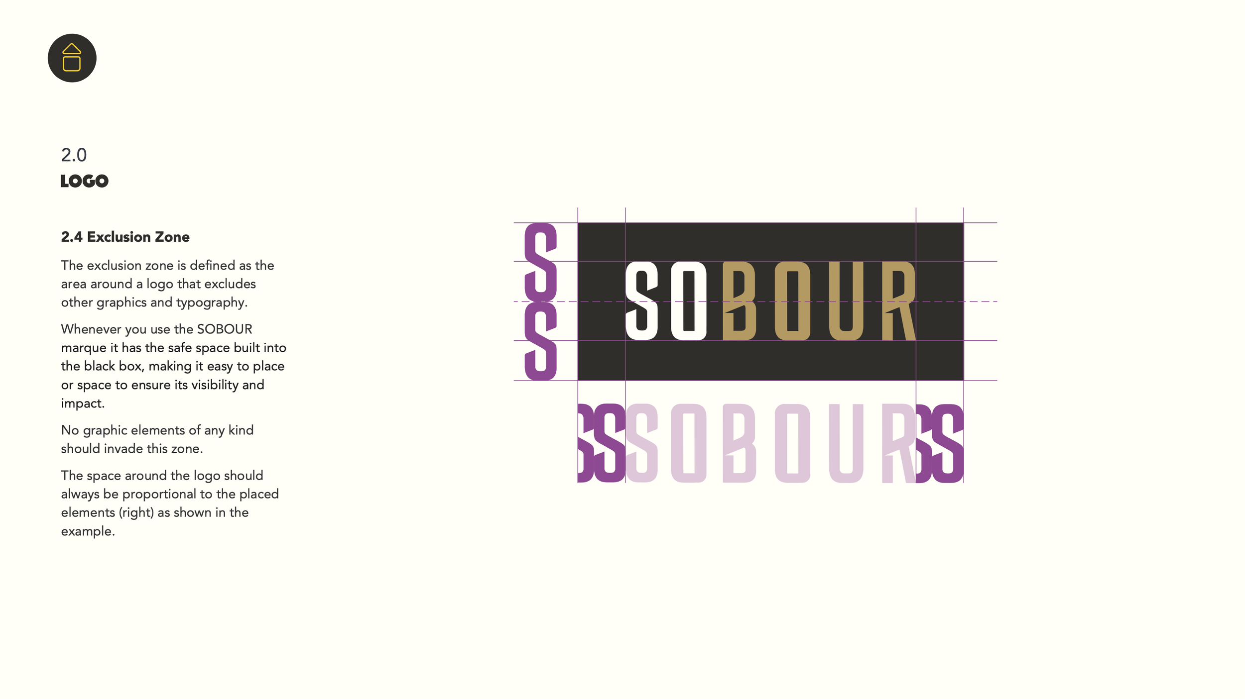
Creating brand names can be a frustrating task: hours spent researching and brainstorming, only to find — once you check the trademarks — that your idea has already been taken by someone who got there first, and the process starts again. With Sobour, the idea was simple. The drink was "so bourbon", even though it was zero-proof. To avoid potential legal issues with using the word Bourbon, I realised that shortening it to "Sobour" gave the brand name a duality of understanding, but surely someone would have registered the name Sobour as the sector of non-alcoholic beverages exploded. Amazingly, this wasn't the case, and the Sobour brand was born.
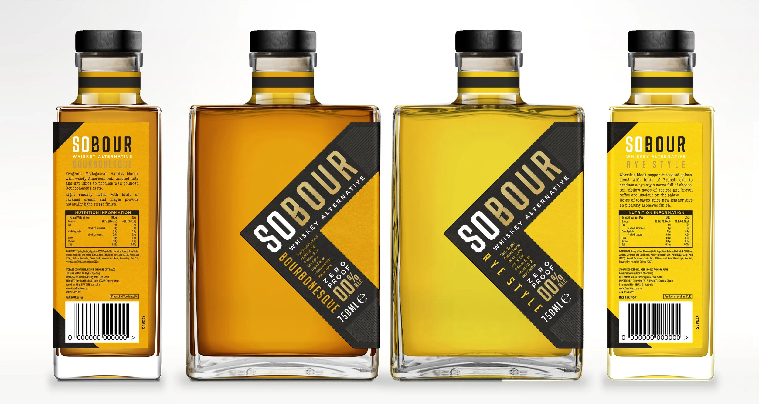
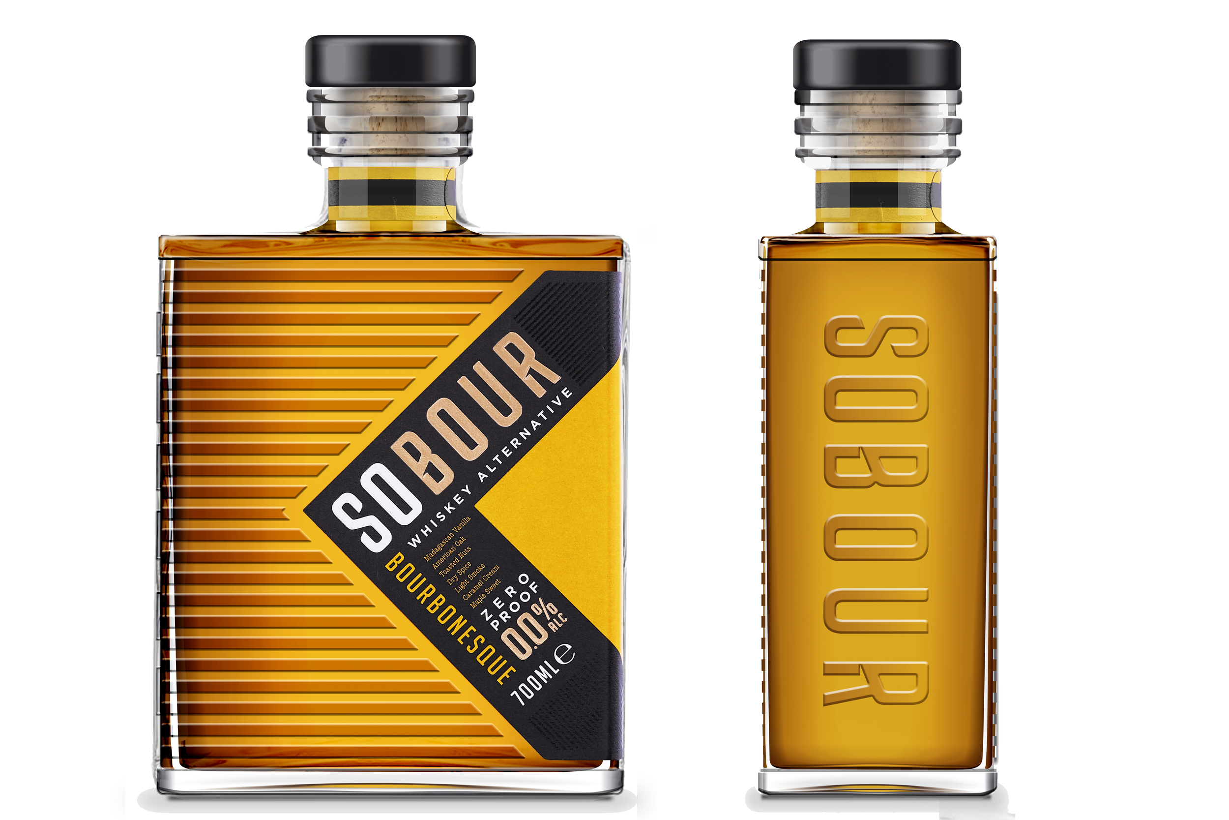
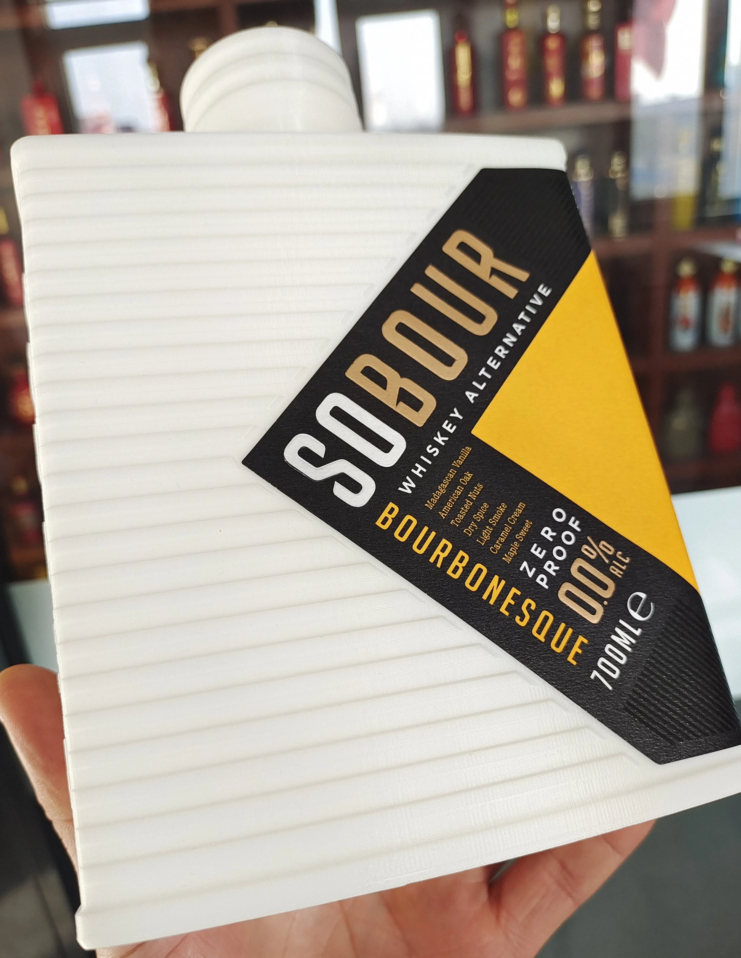
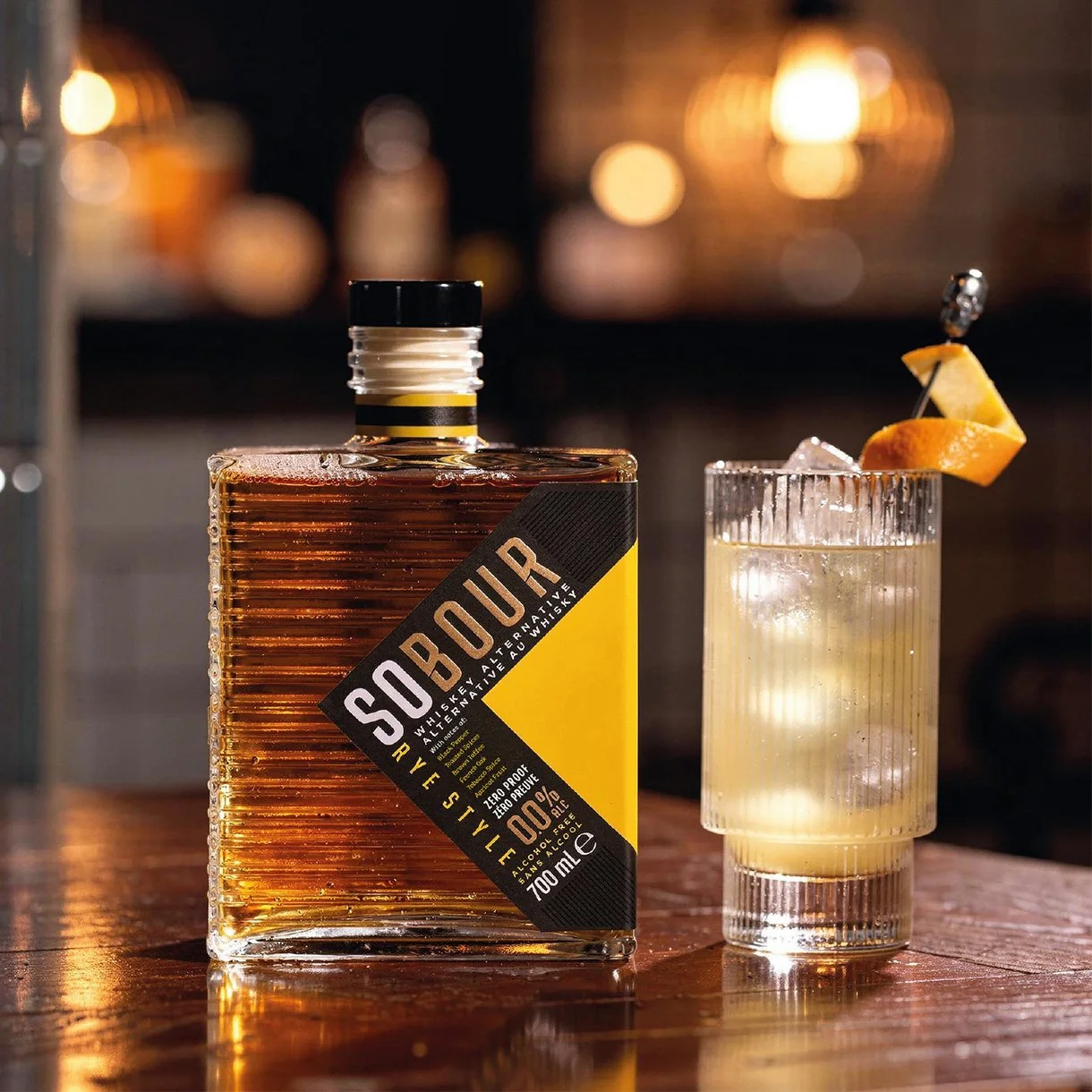
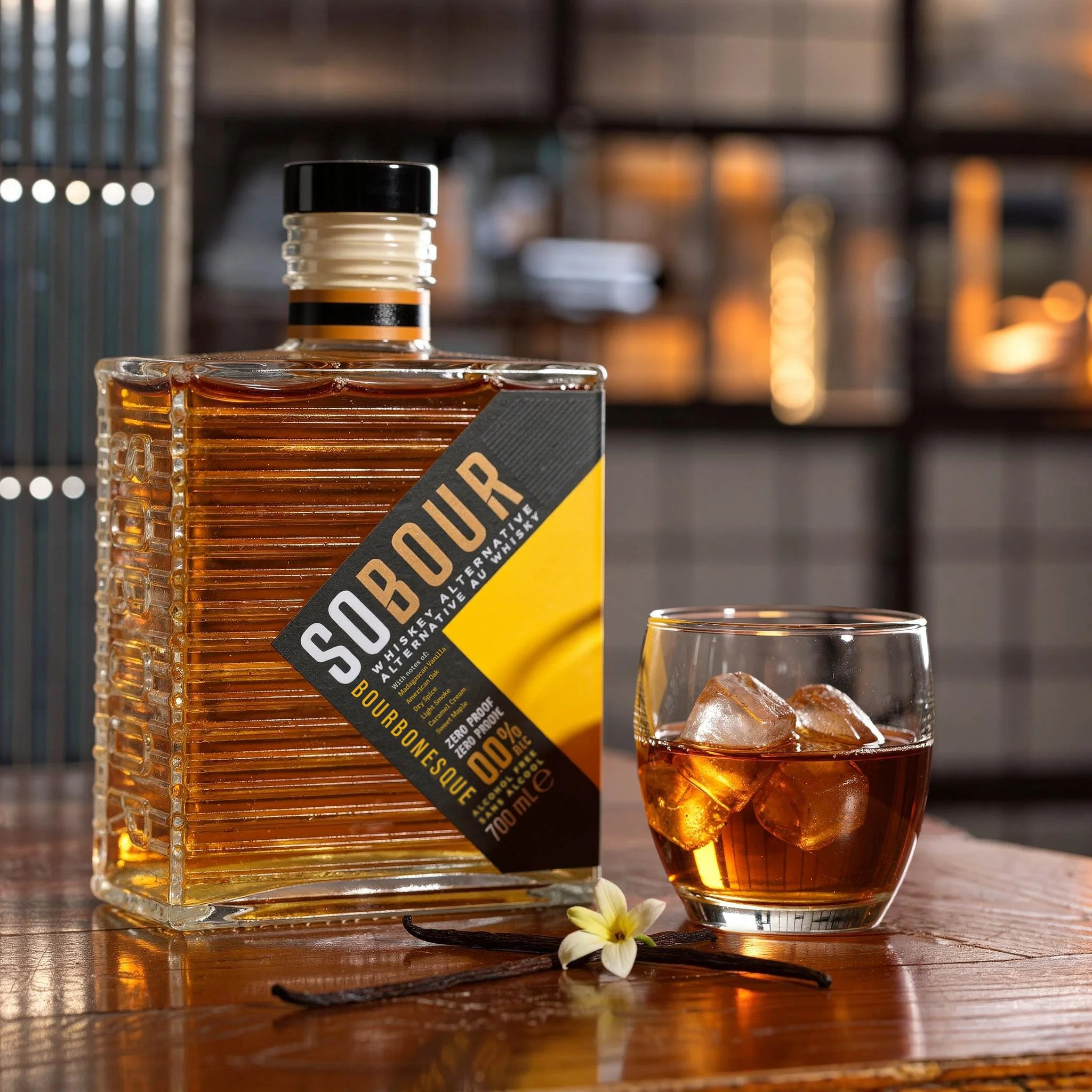
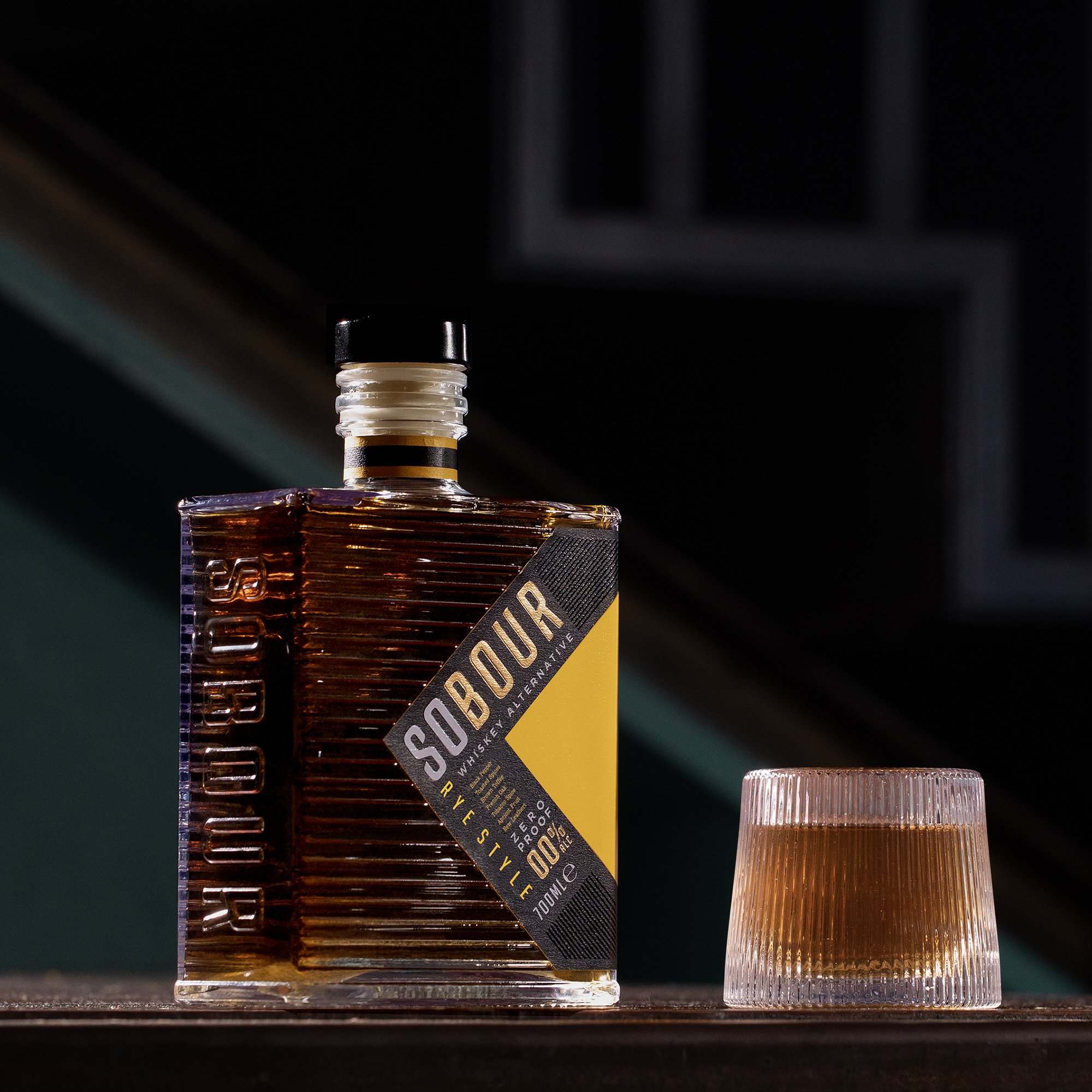
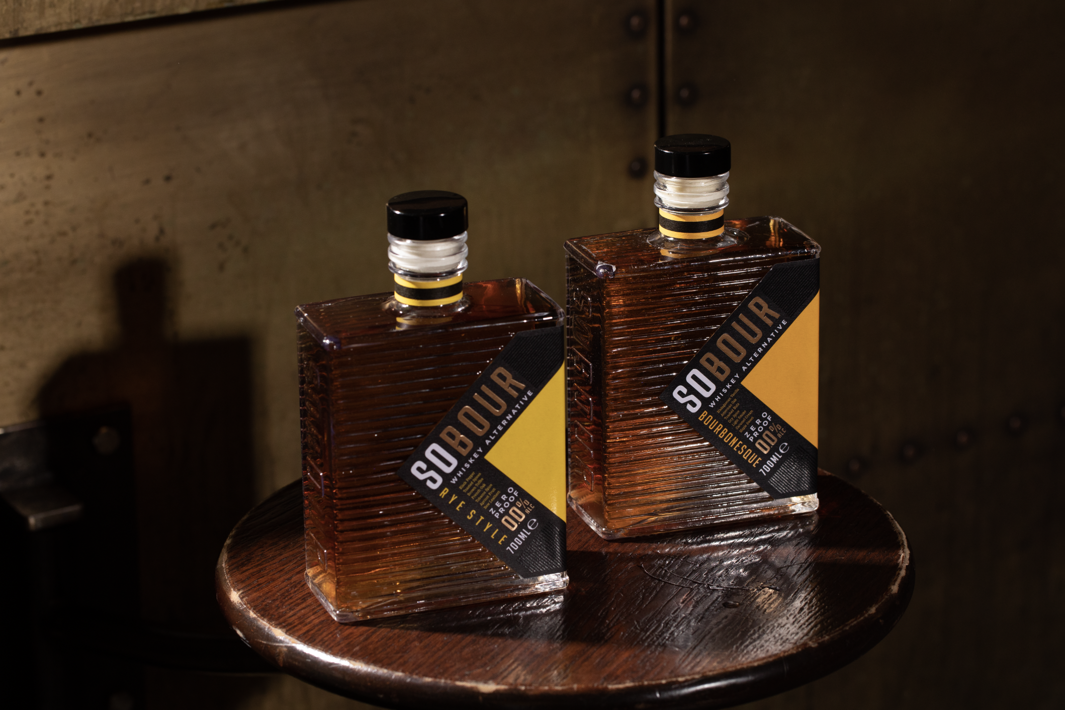
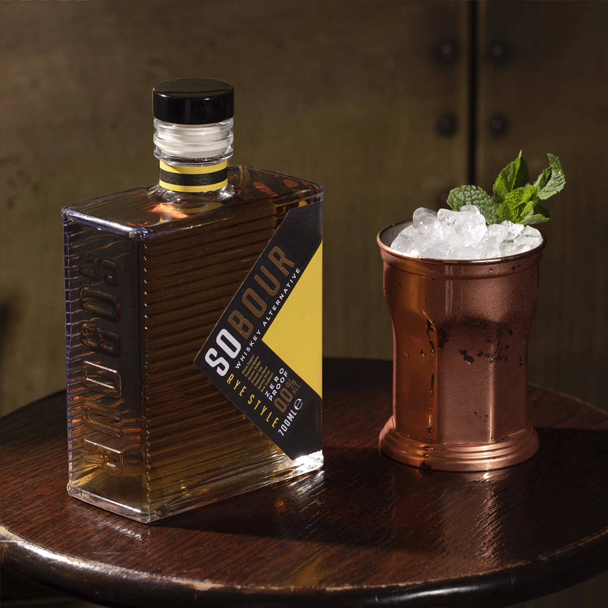
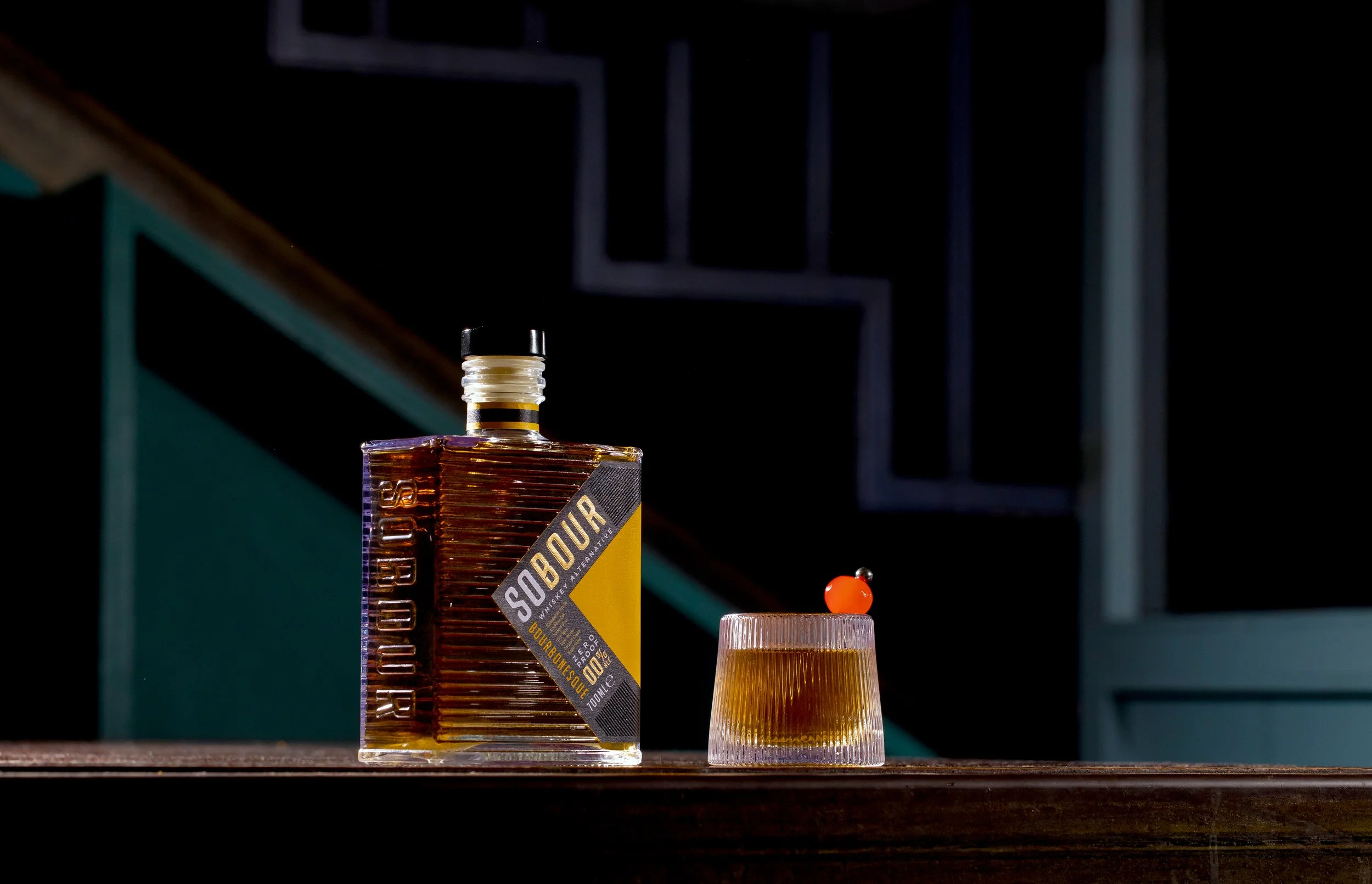
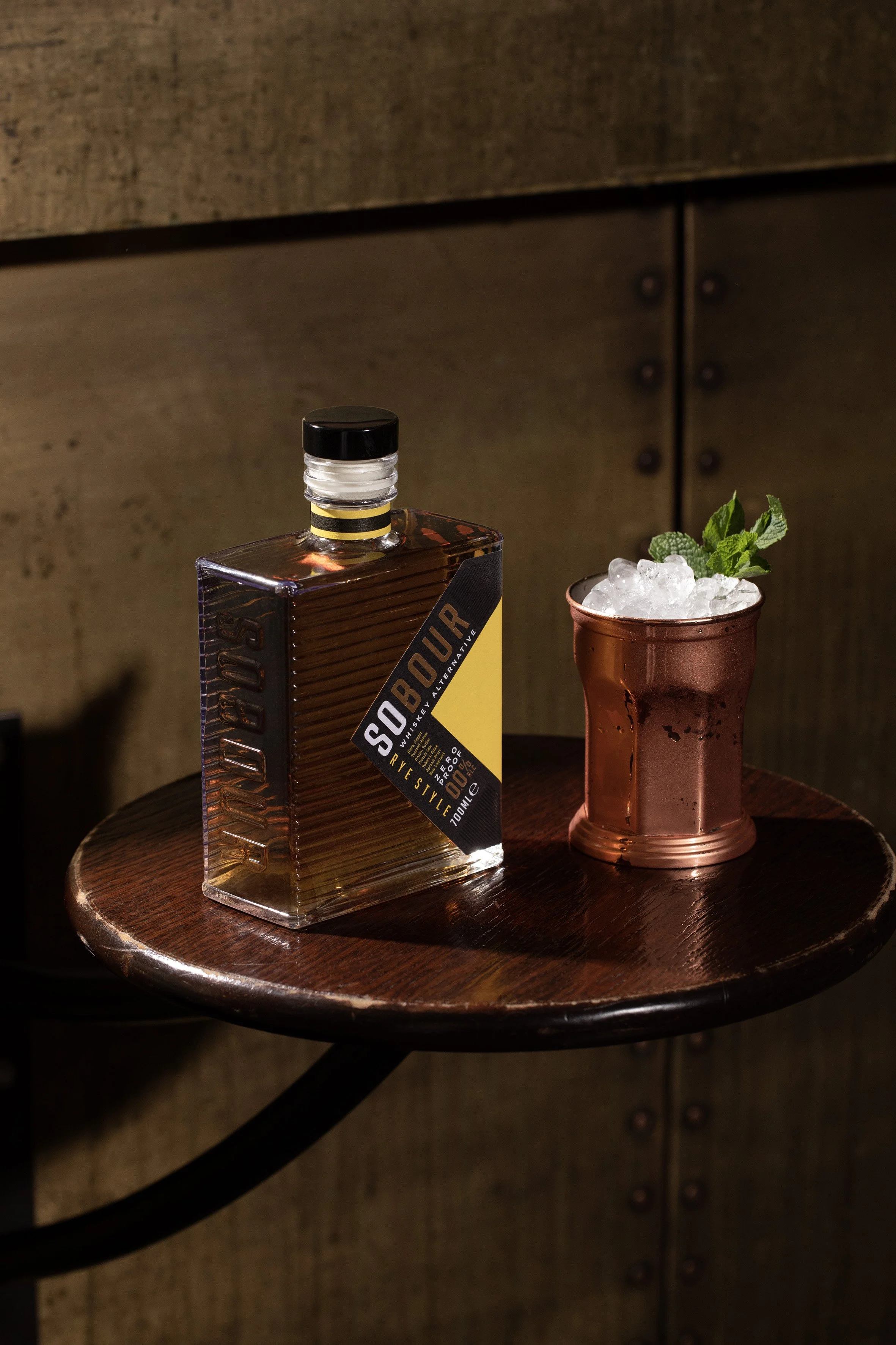
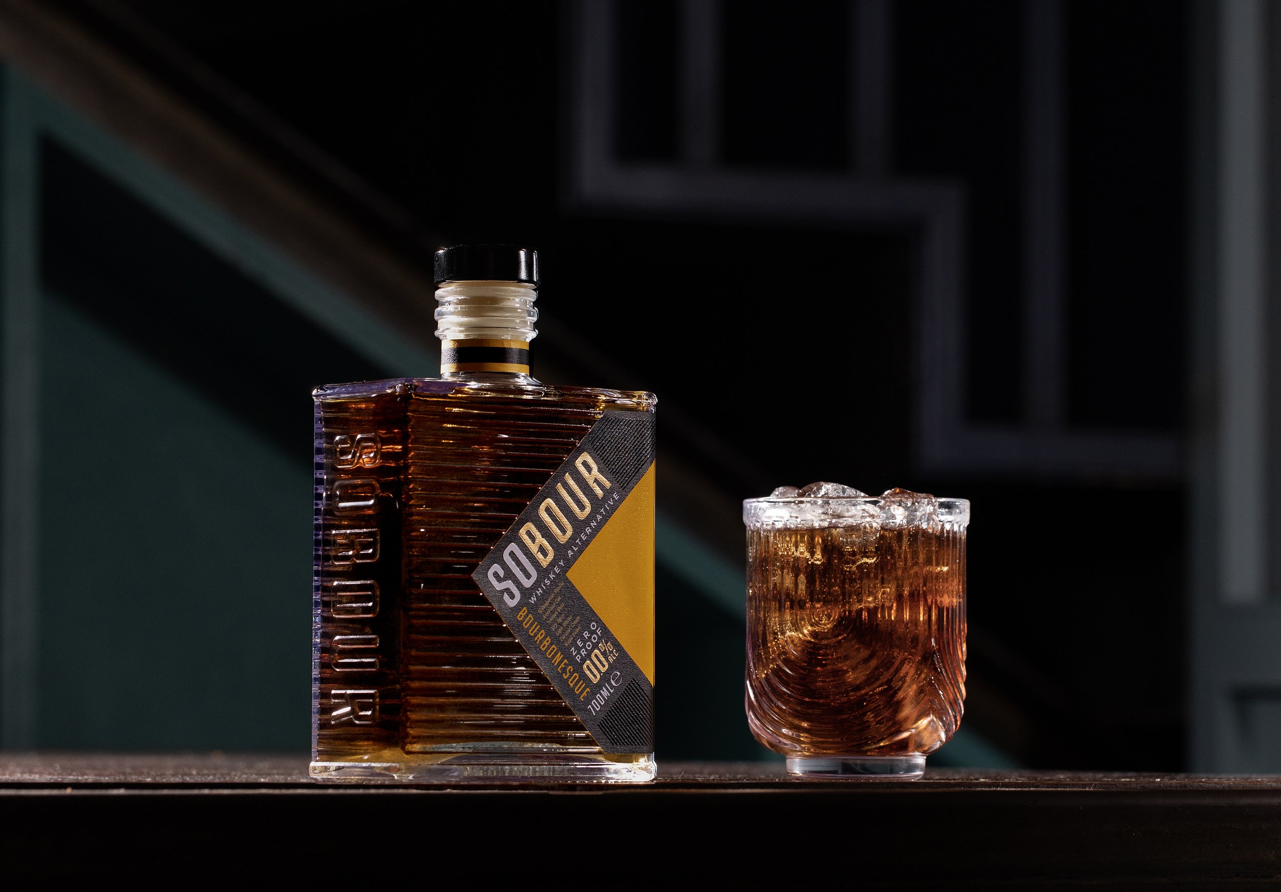
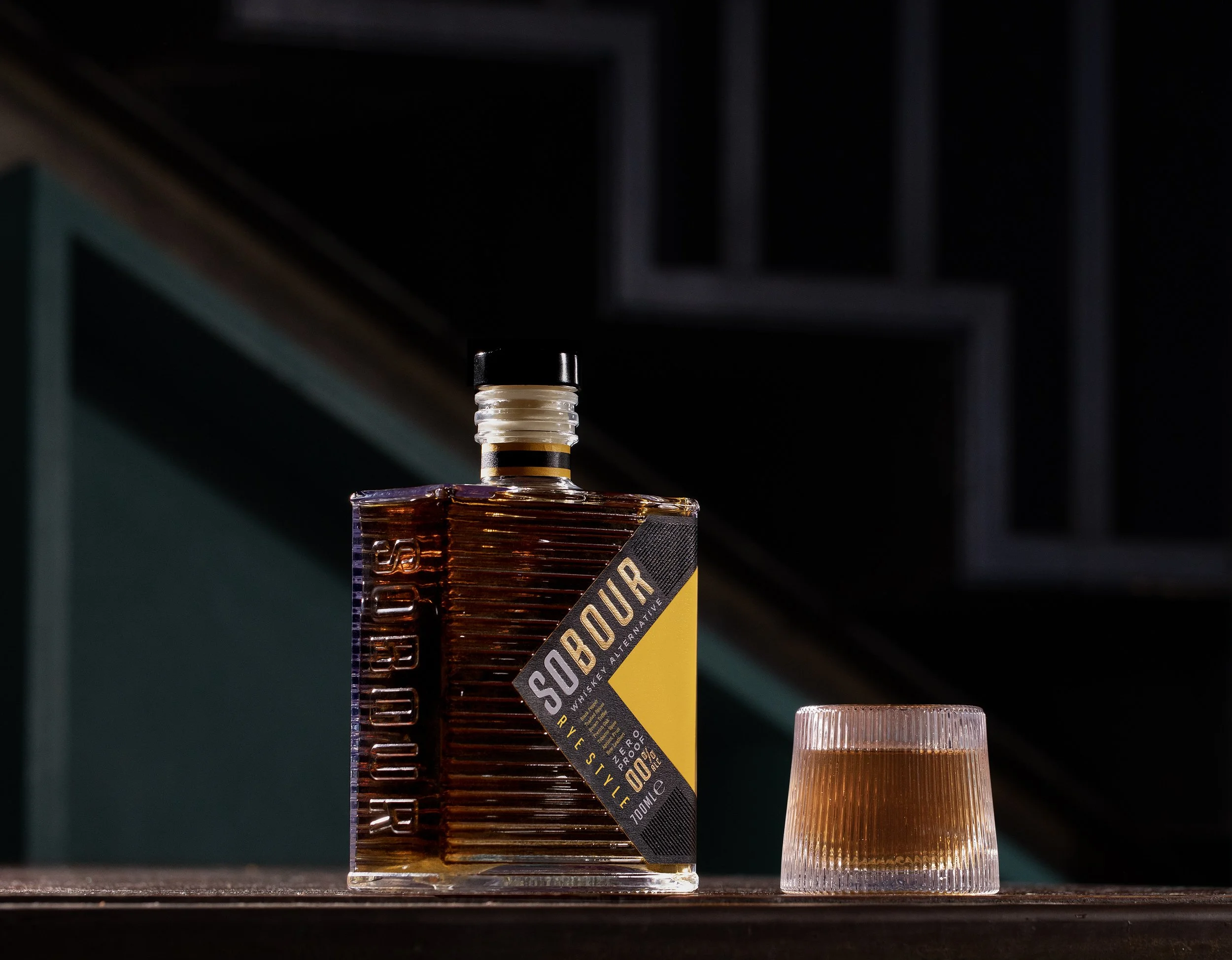
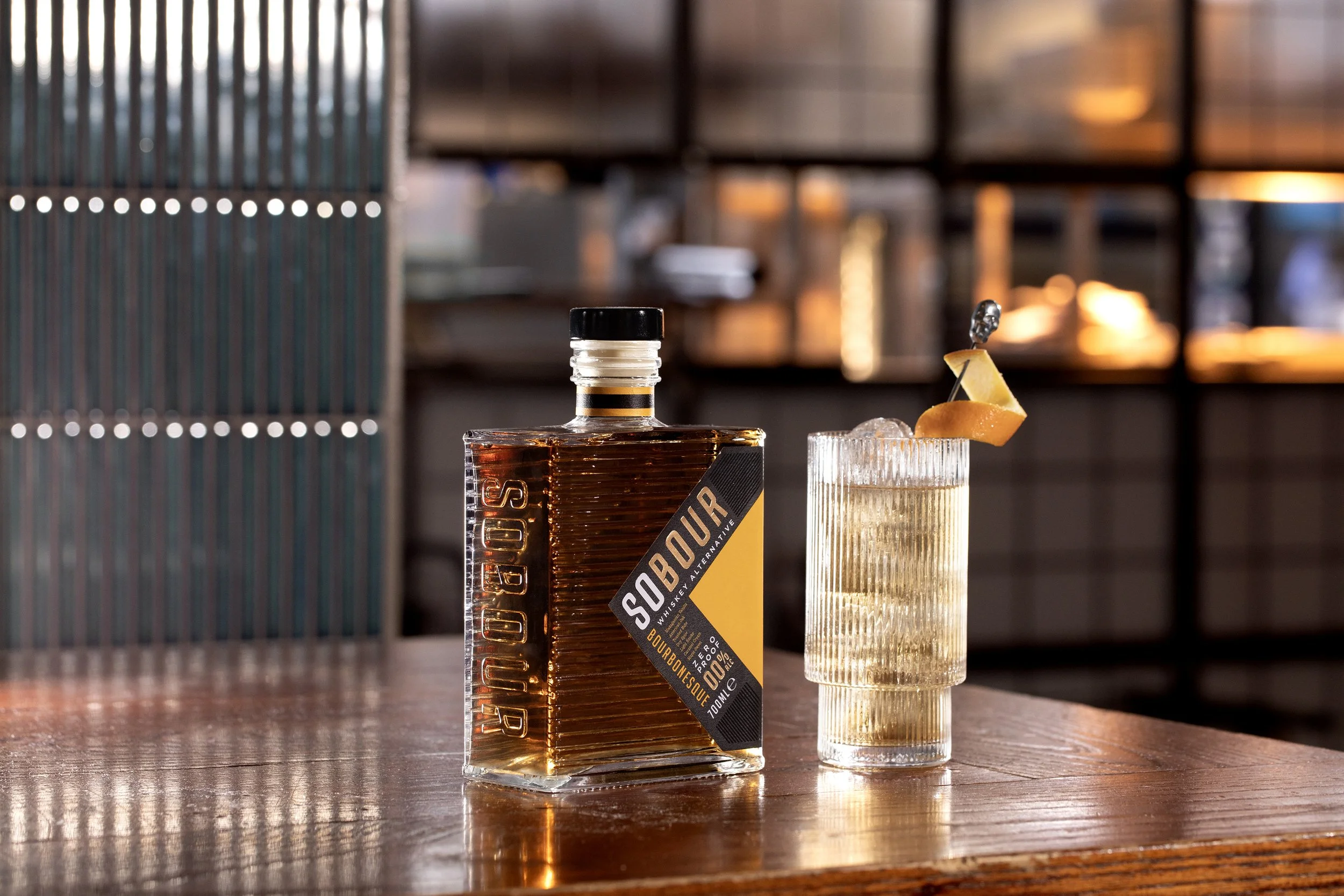
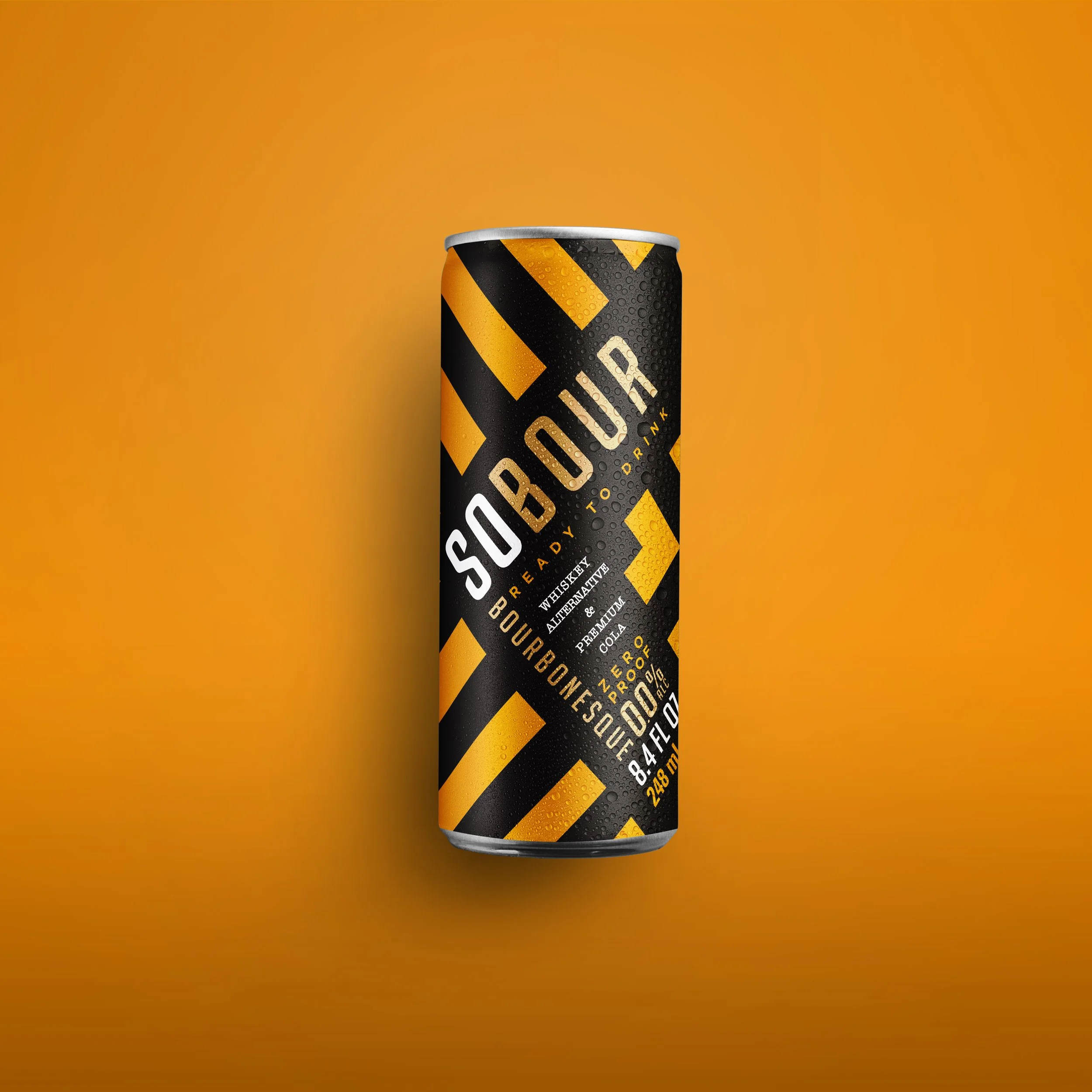
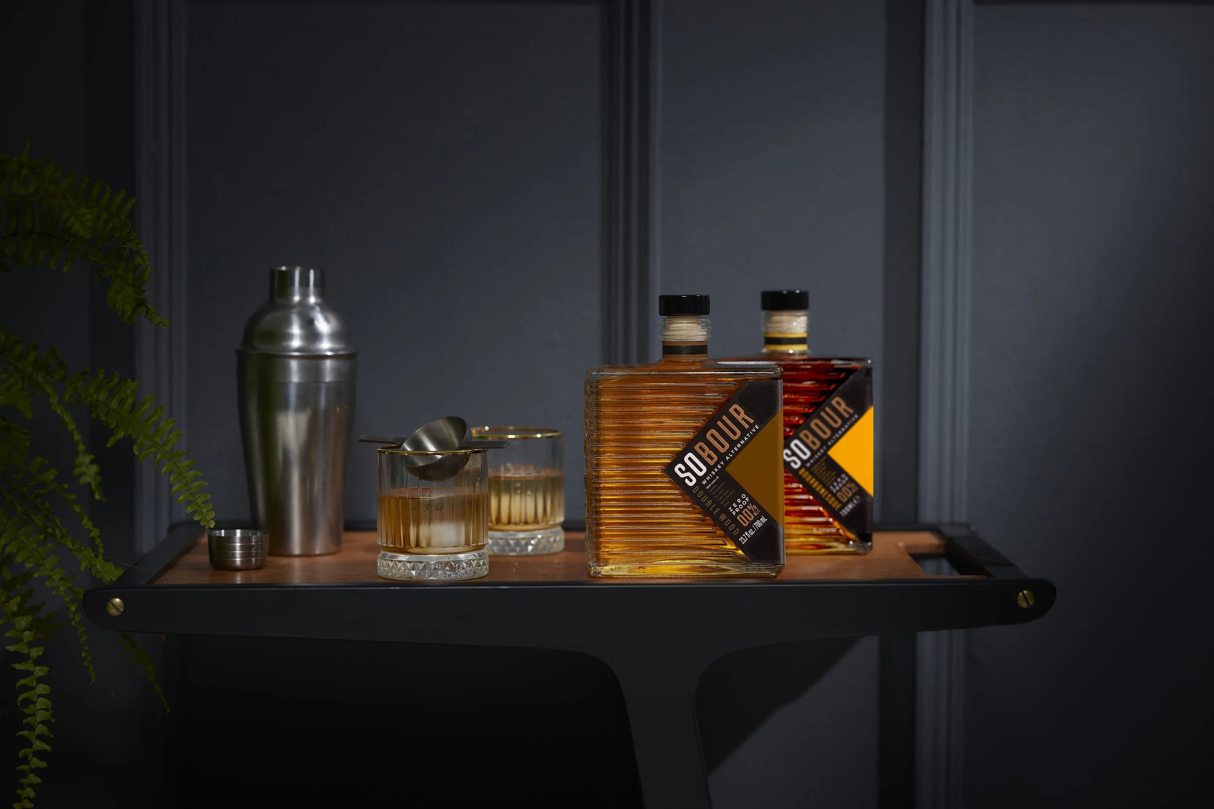
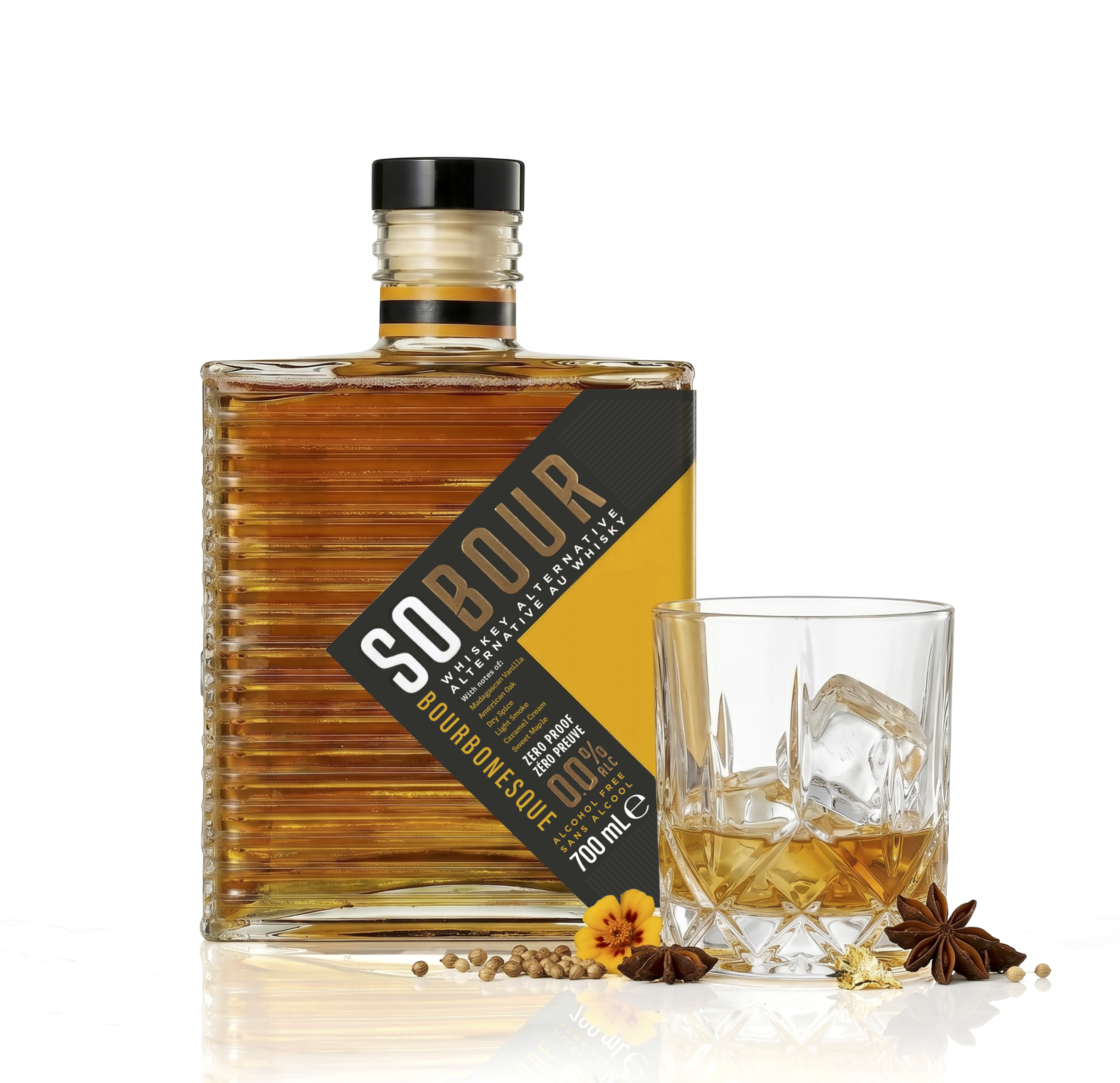
To make the brand disruptive and uniquely "ownable", the branding was placed on an angled label, pushing the brand to the centre of the presentation, forming distinct visual shapes that the brain would register on shelf at a distance.
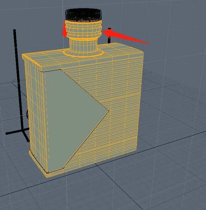
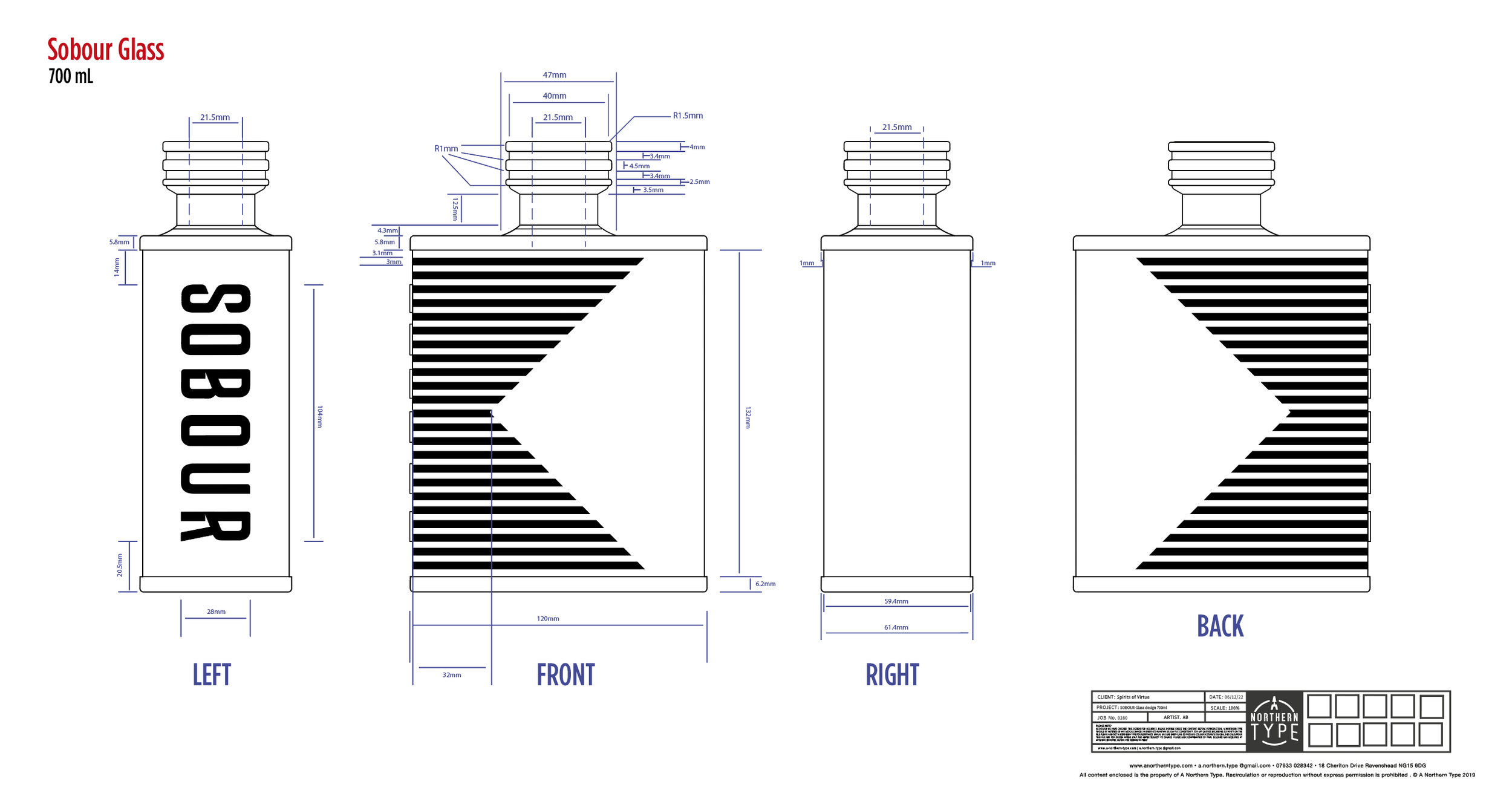
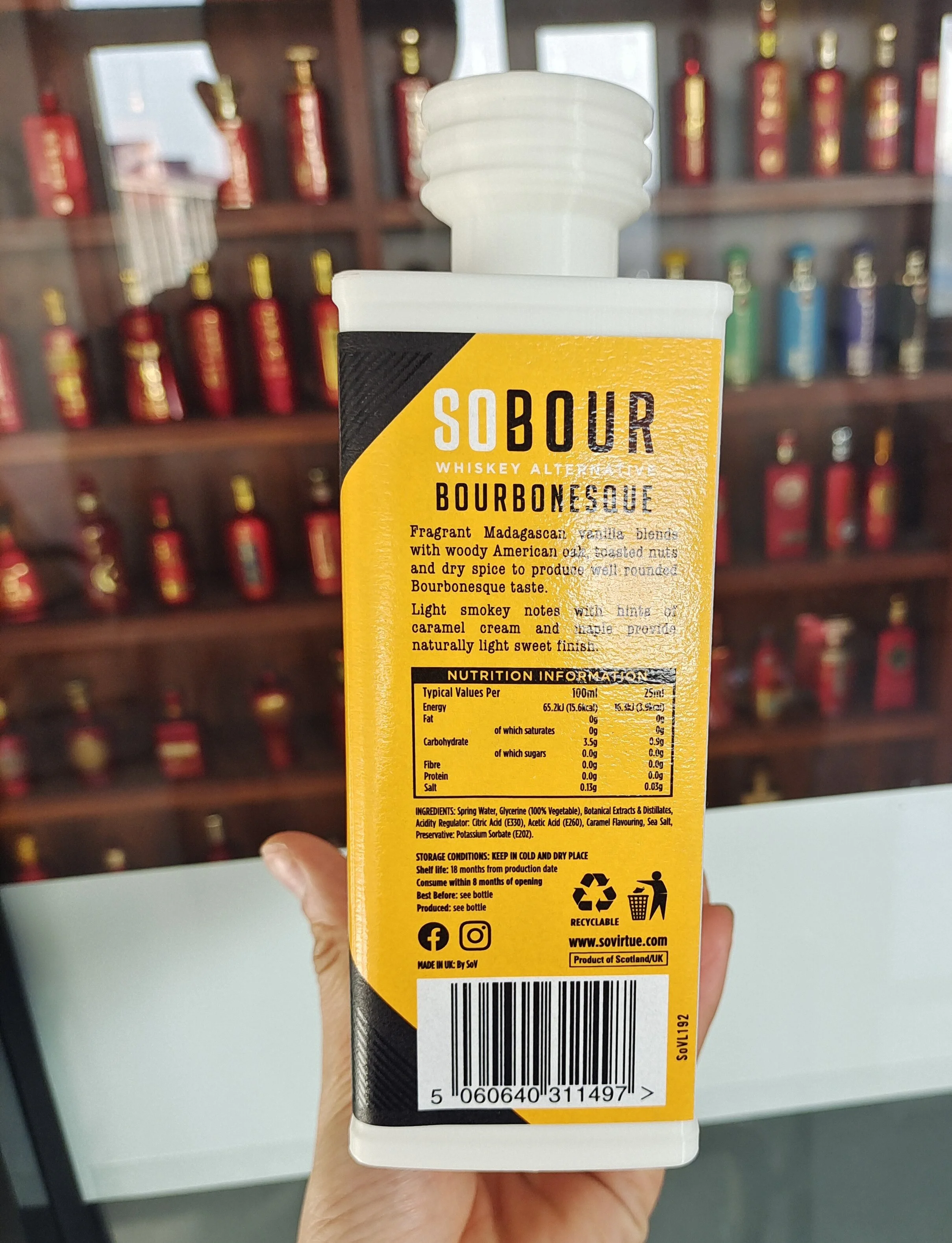
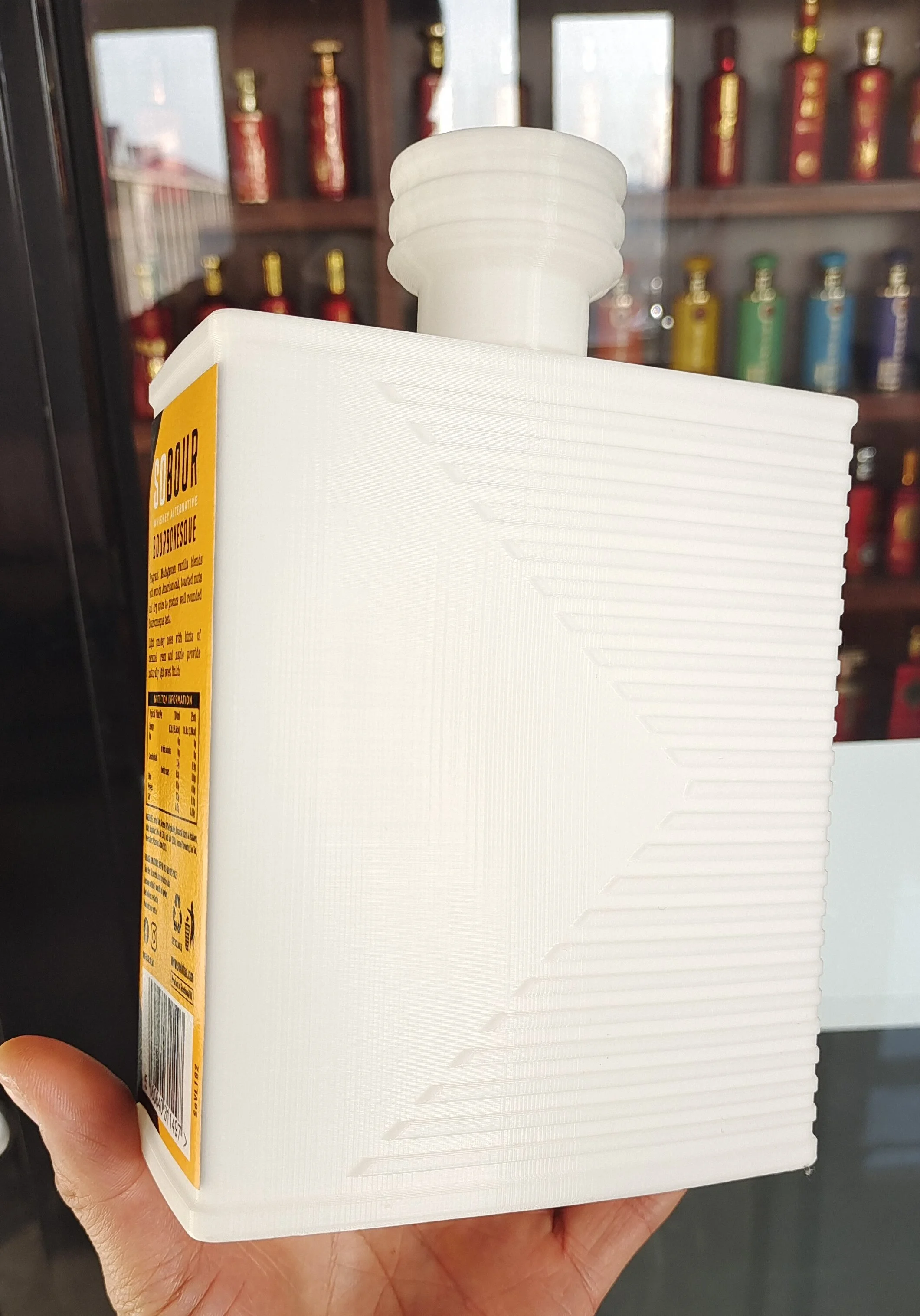
Sobour launched on a rectangular stock bottle, but the decision was eventually made to create bespoke glass to further enhance the product appeal. The stock bottle had weight, and its shape required a firm grip when pouring. The new design negated this with embossed horizontal ribs, which made holding the bottle while pouring much easier.