Glendochus Scottish Botanical Beverage
Brand and range design for non-alcoholic whisky alternative range.
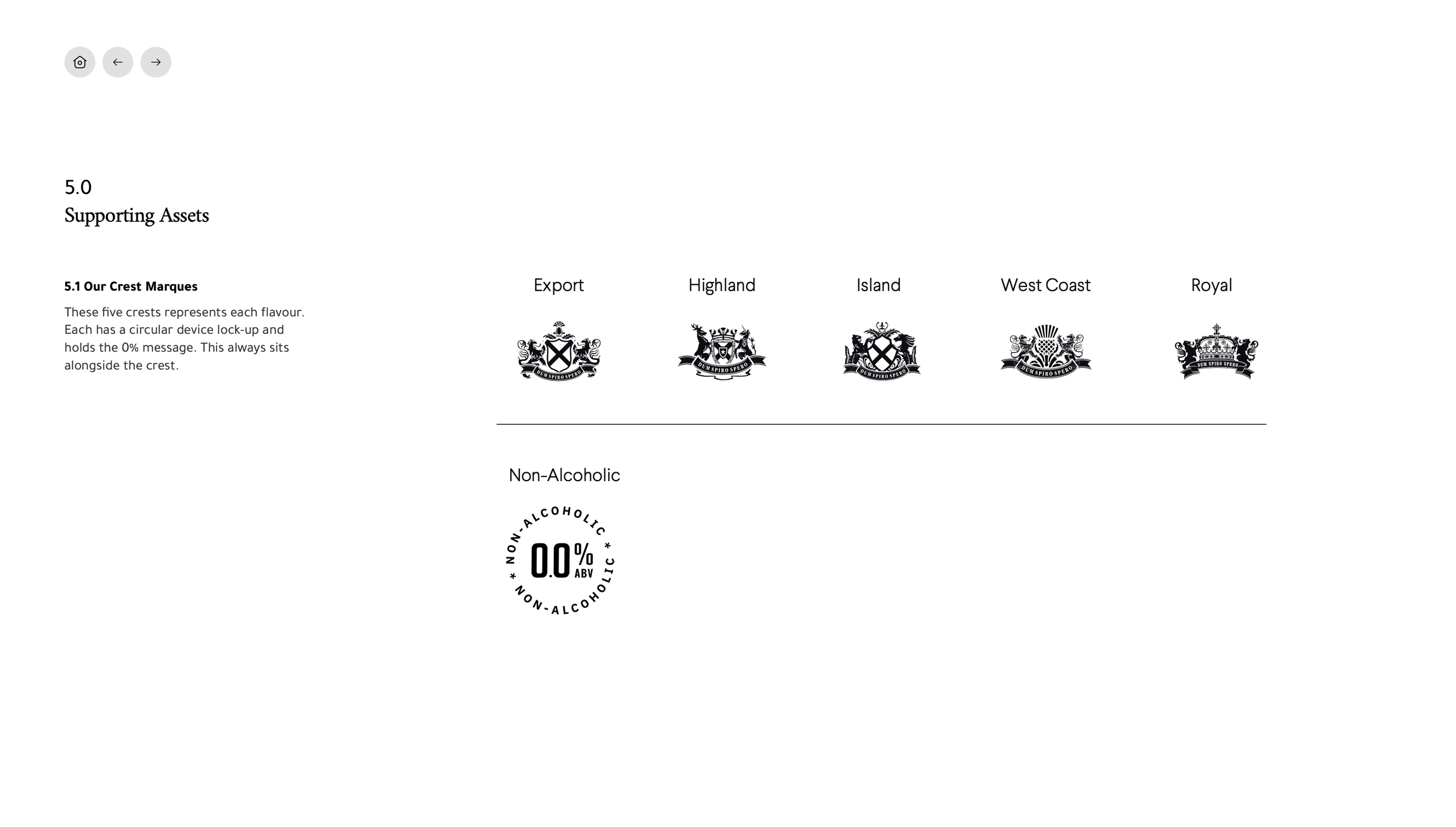
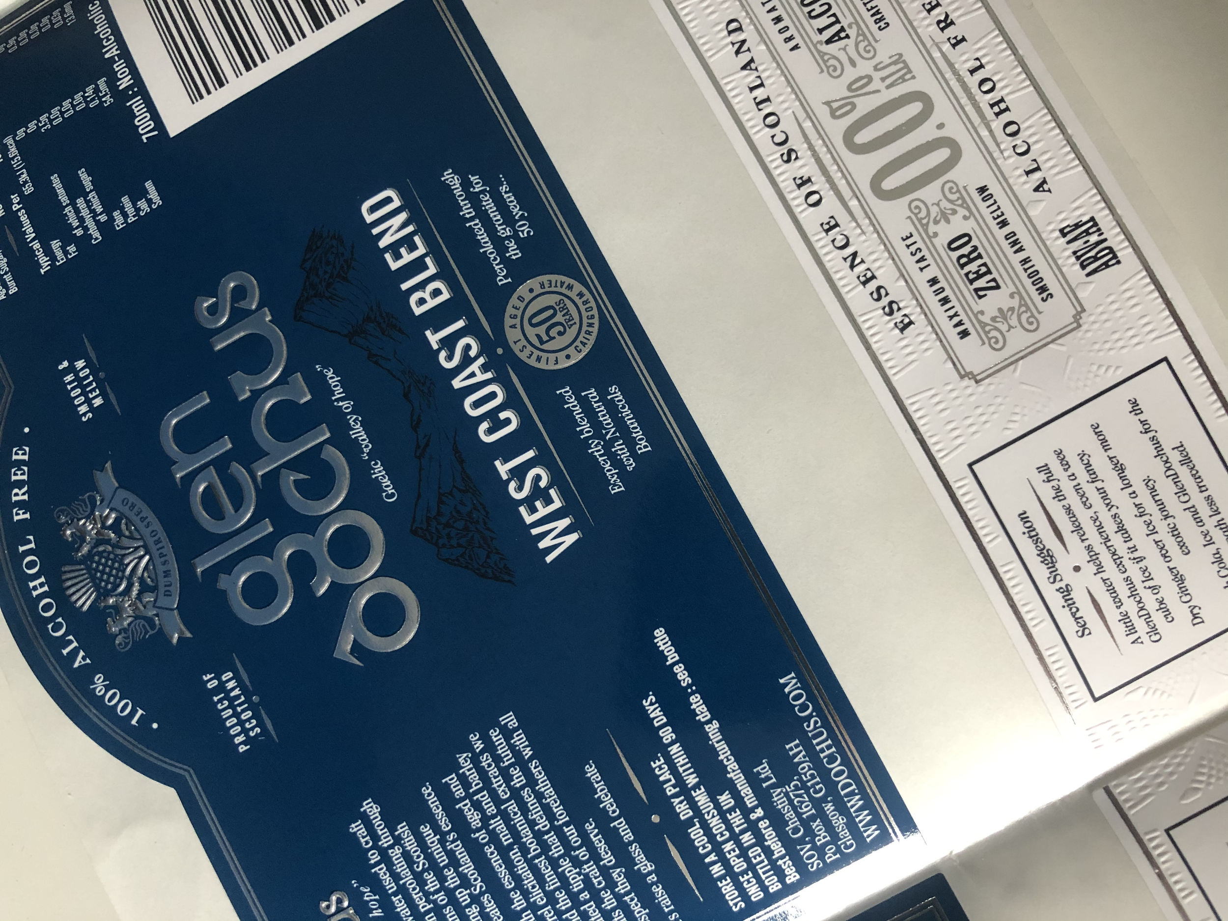
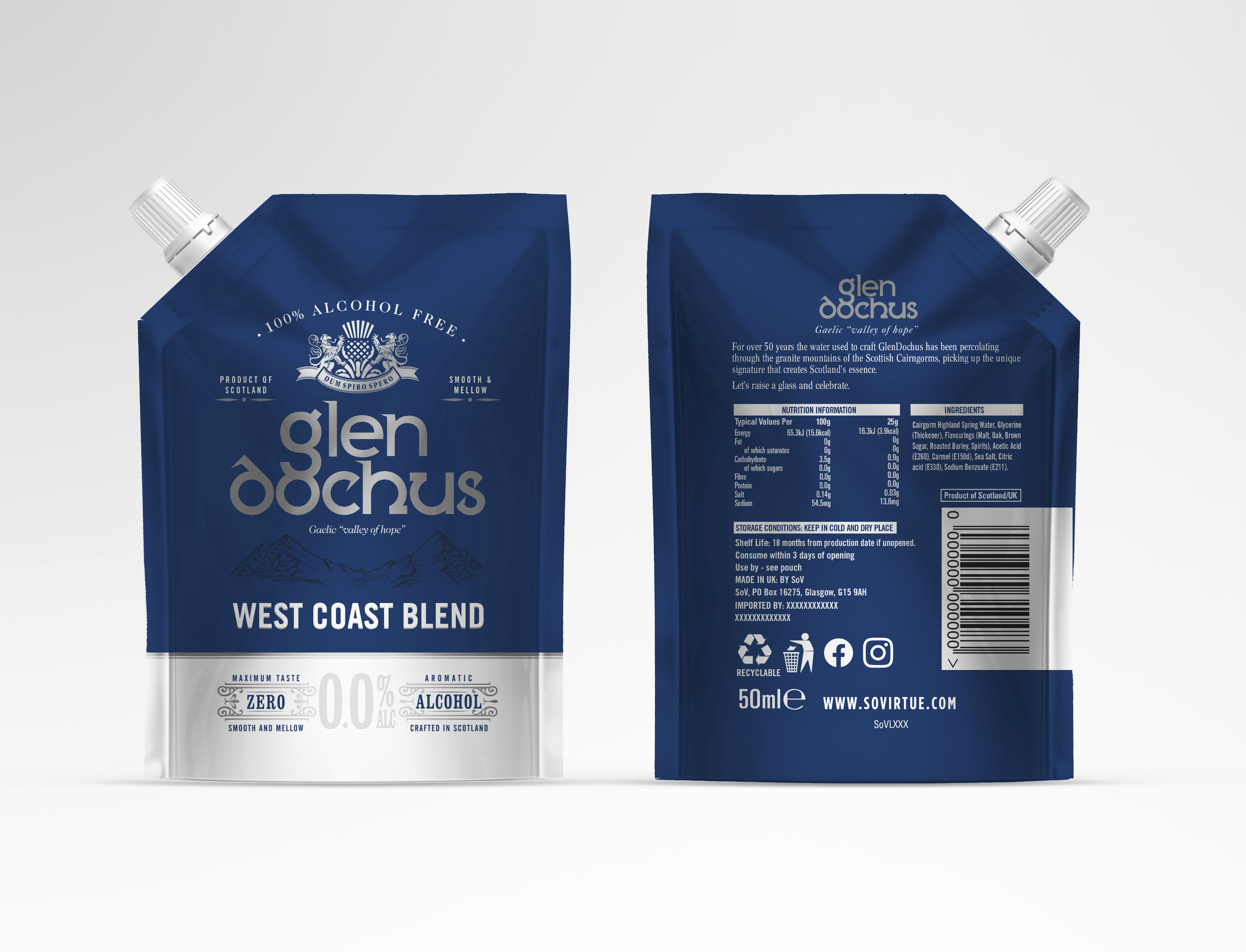
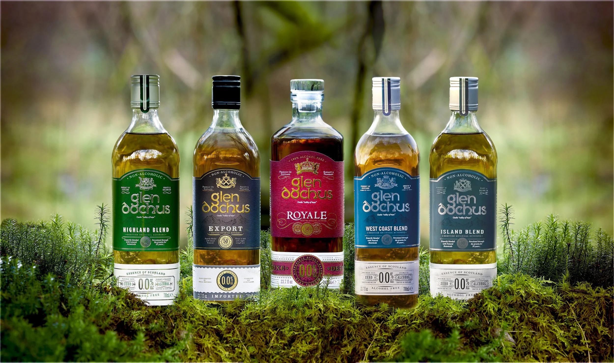
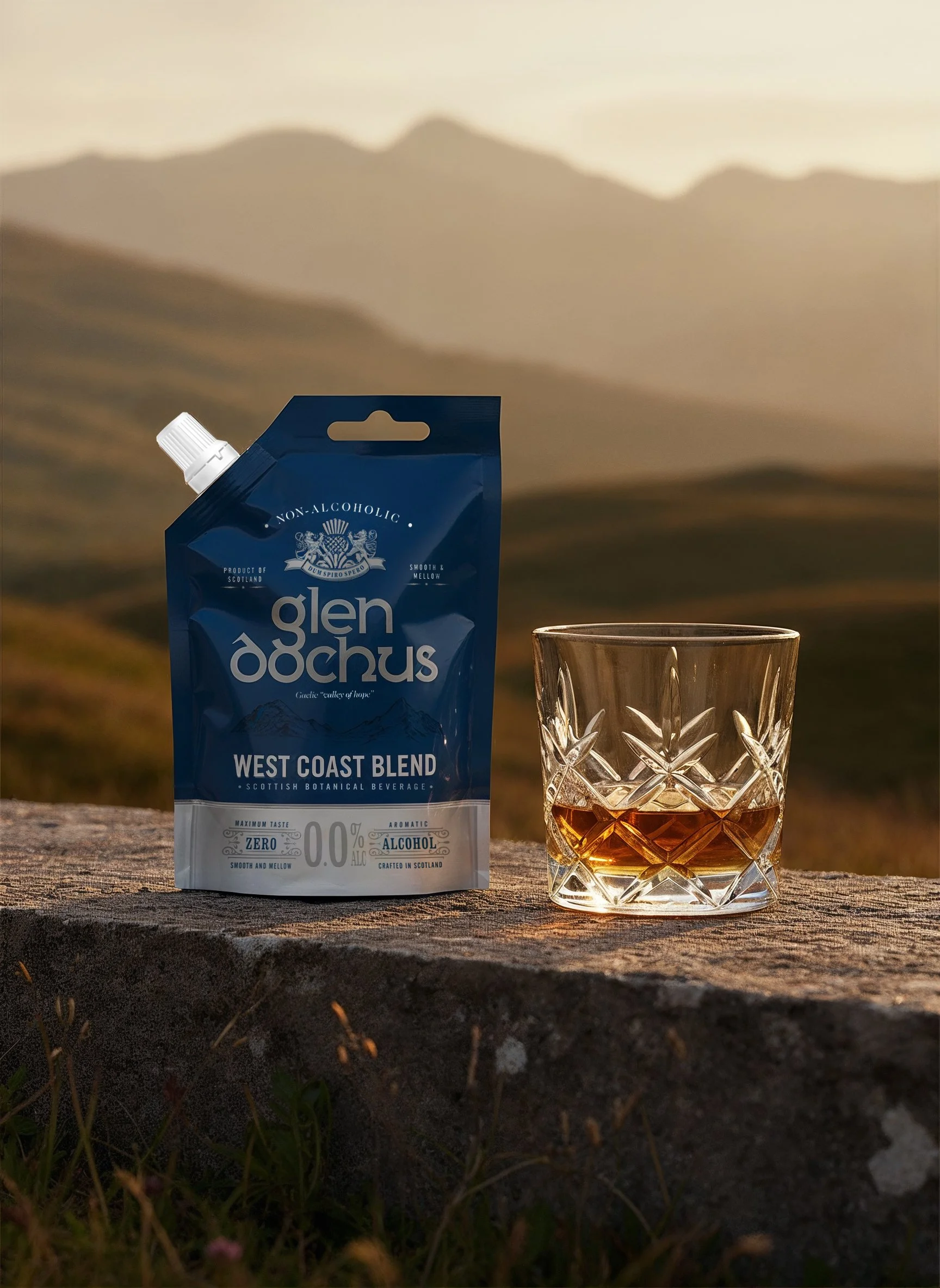
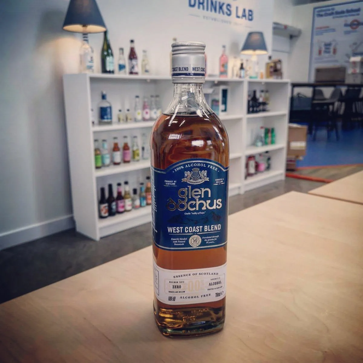
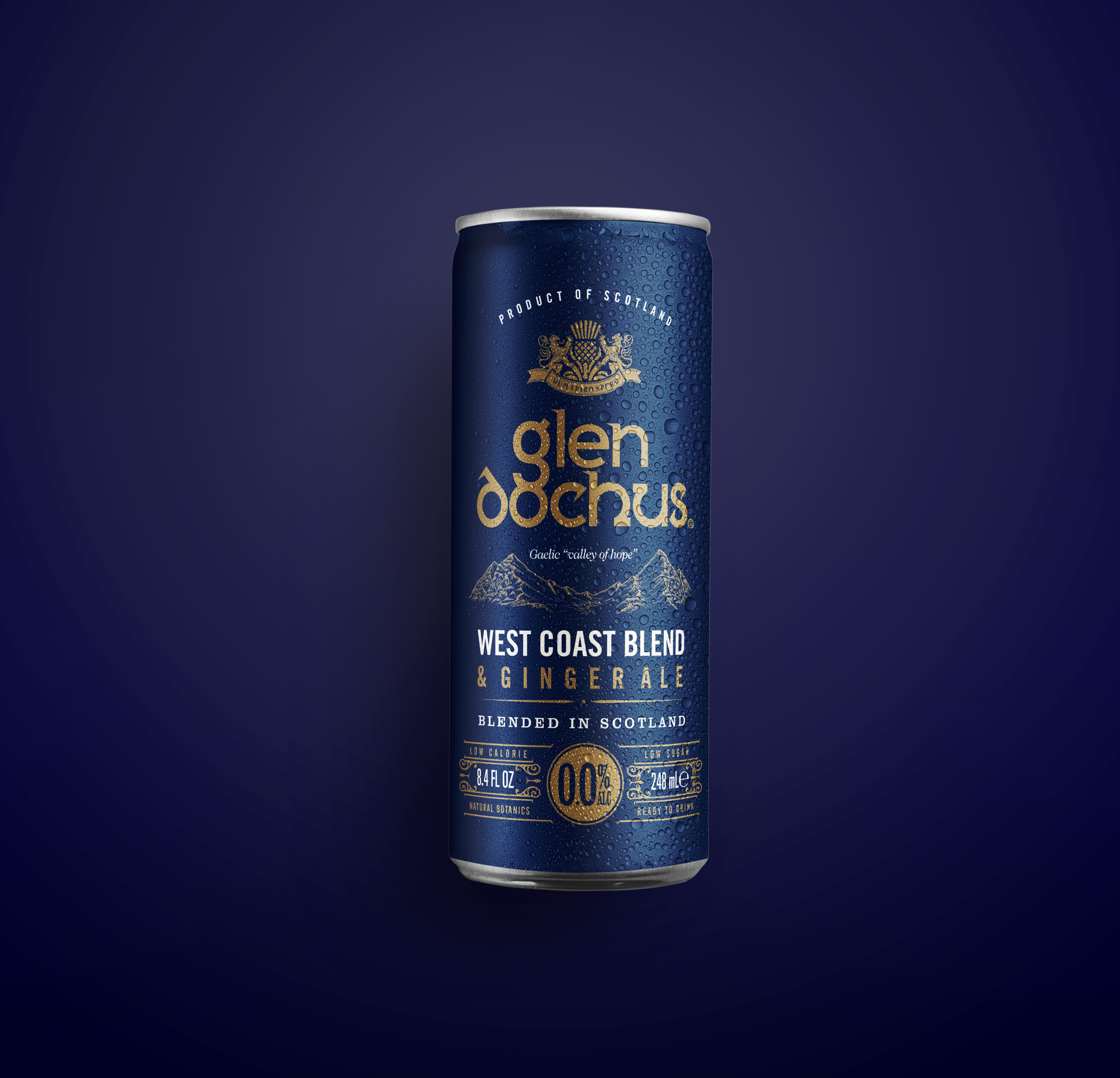
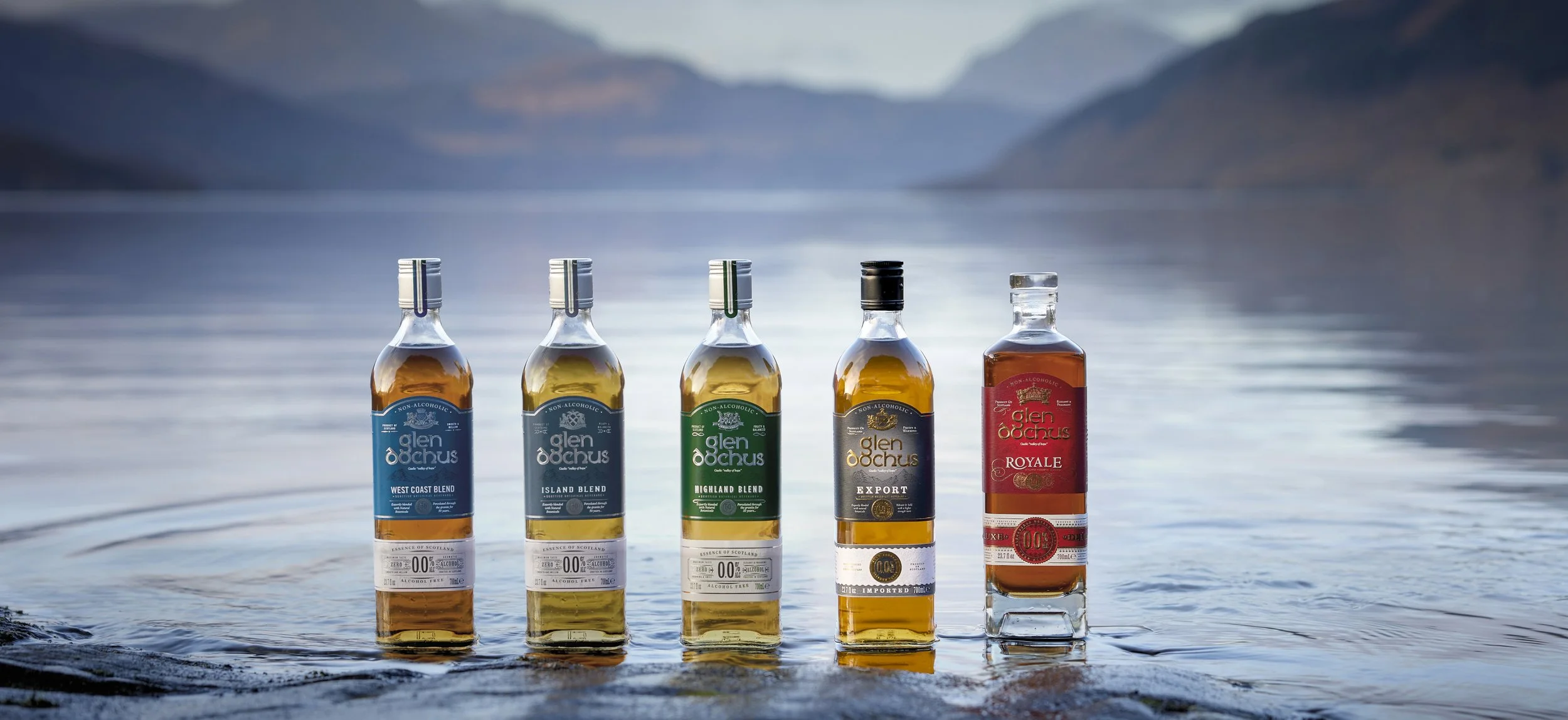
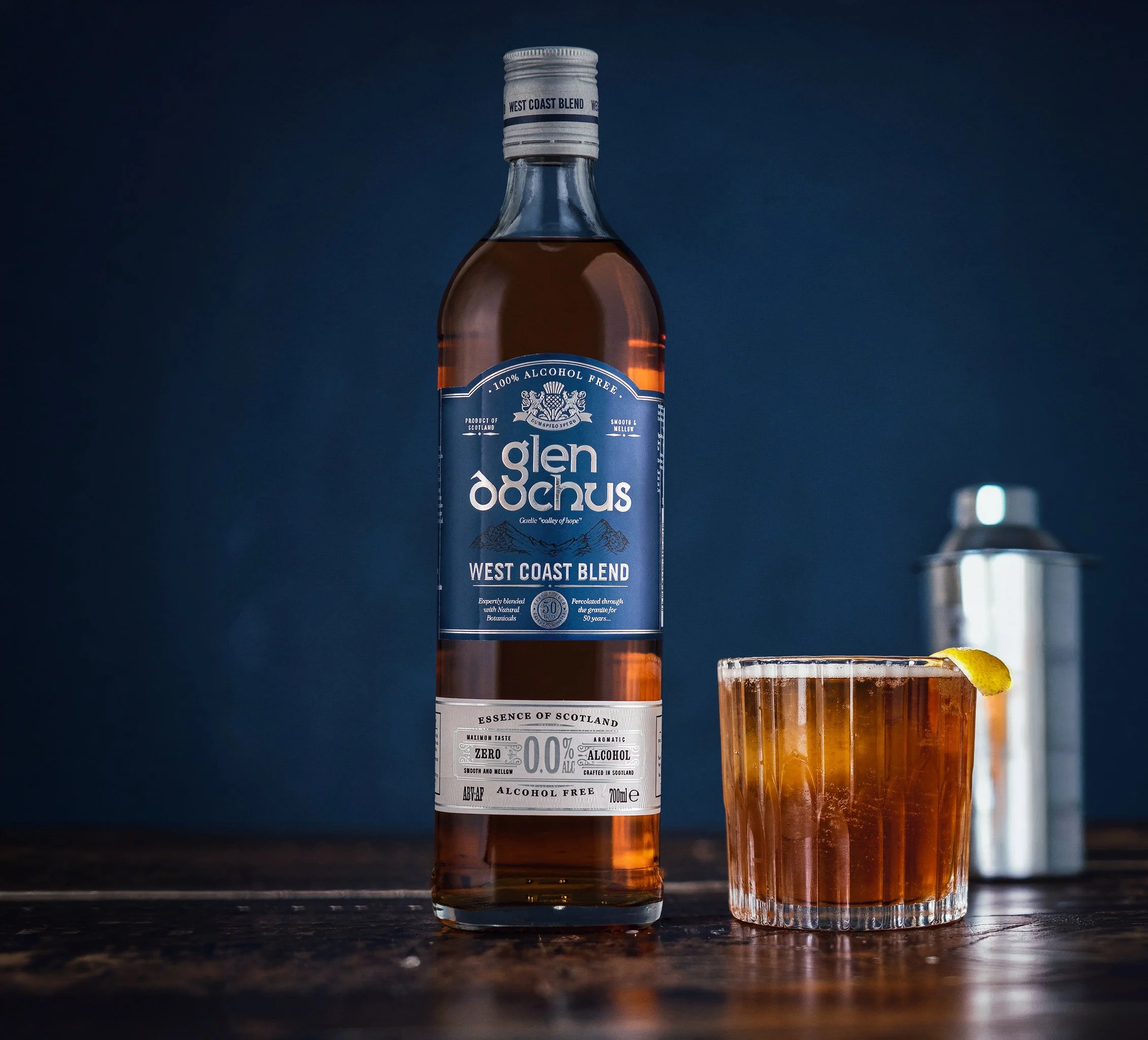
CLIENT BASED: UKThe development of Glendochus has spanned nearly a decade. The brand began with a single expression — the West Coast blend, marked by its own heraldic crest — and has since grown into a core range of five flavour-profiled blends, each one unmistakably Glendochus and true to the essence of Scotland.
The Glendochus name was chosen for its Gaelic meaning, "valley of hope" — an optimistic expression for a new type of Scottish beverage. The name speaks to reinvention: rooted in heritage, yet open to something new. It carries a quiet confidence, evoking glens shaped by centuries of water and weather, and the belief that something enduring can still be reimagined for a new generation.
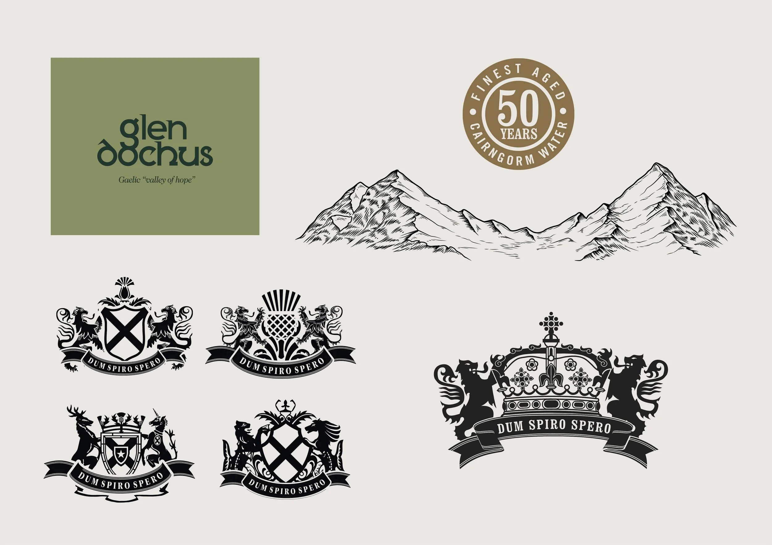
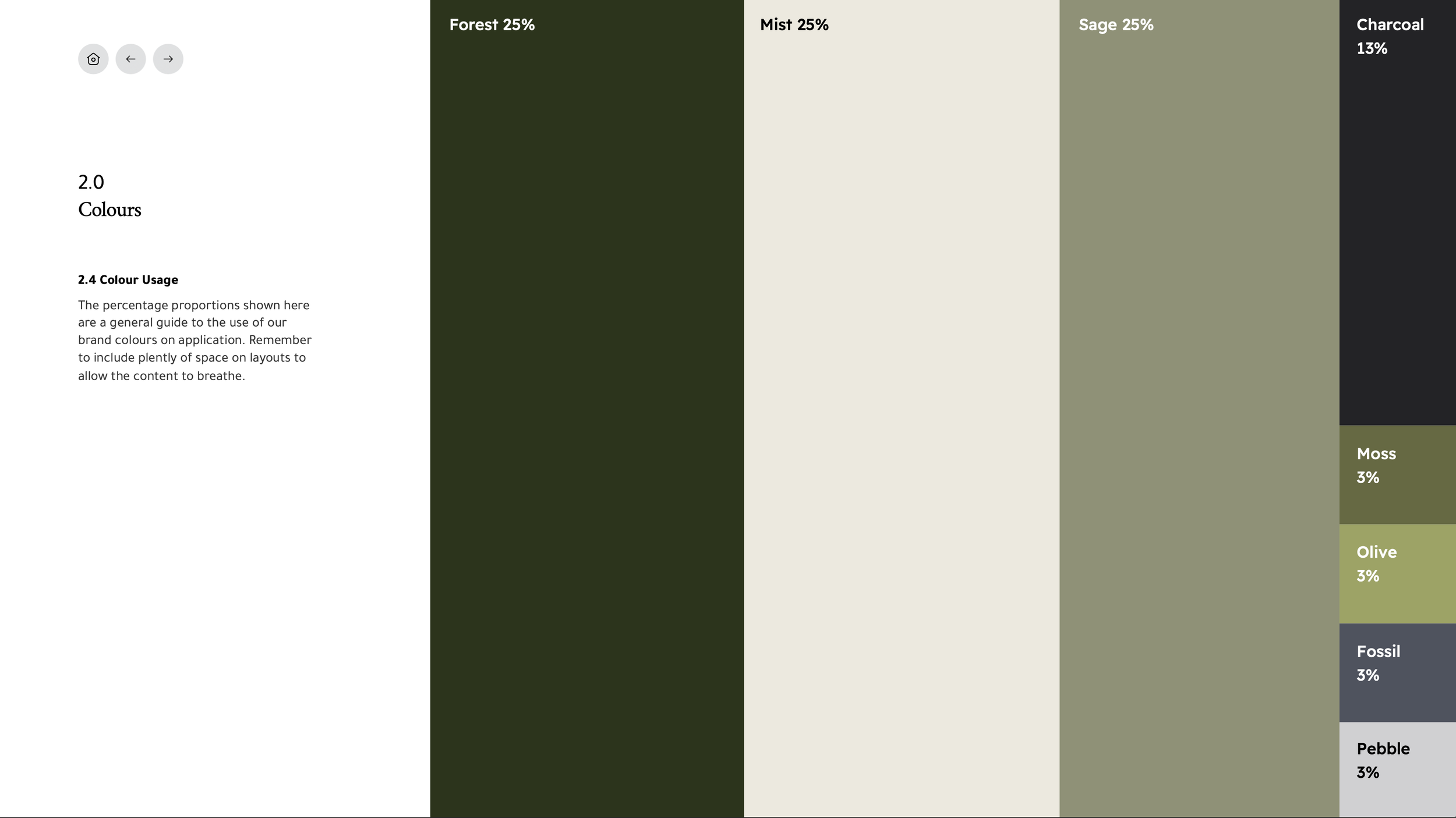
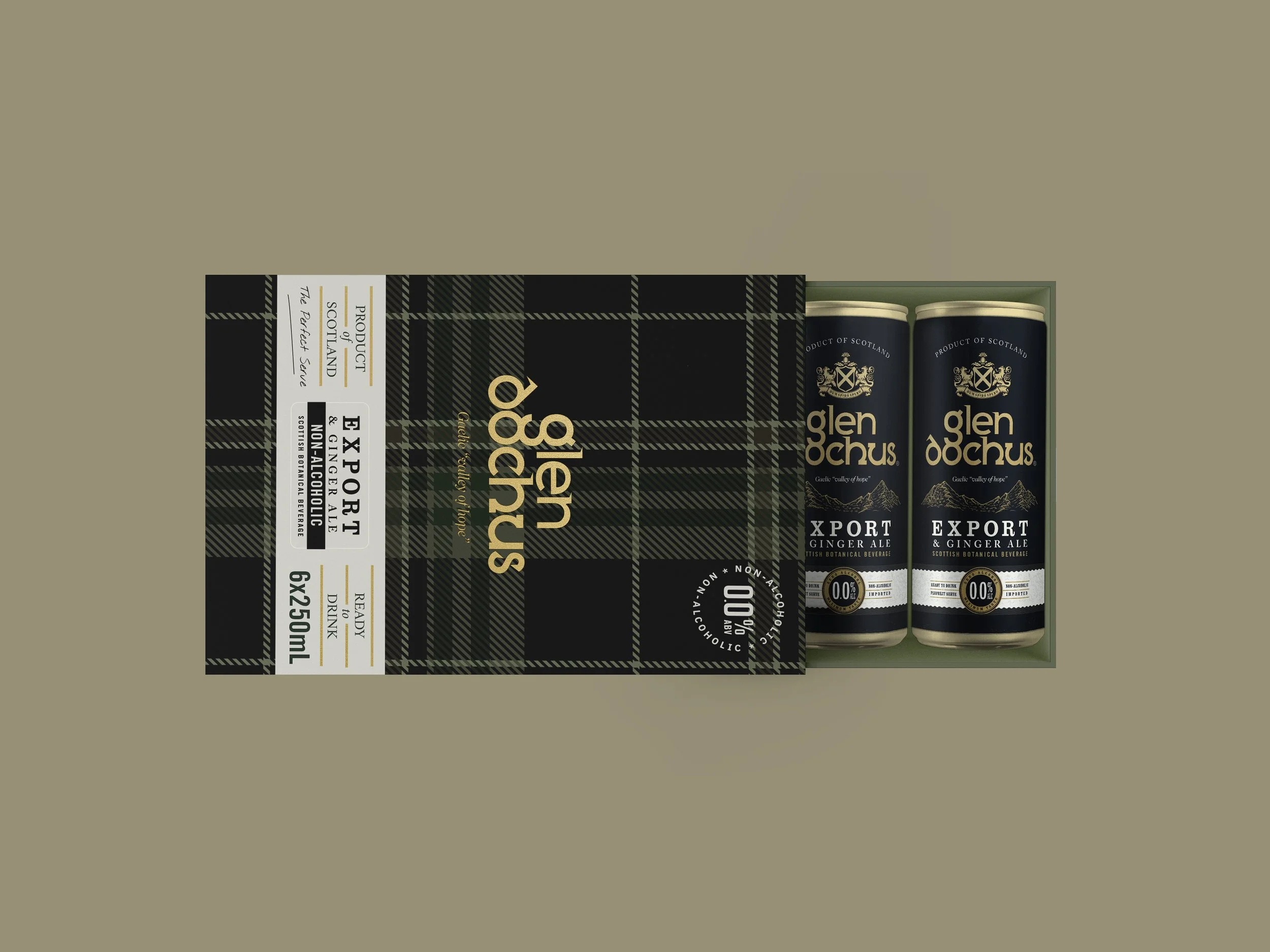
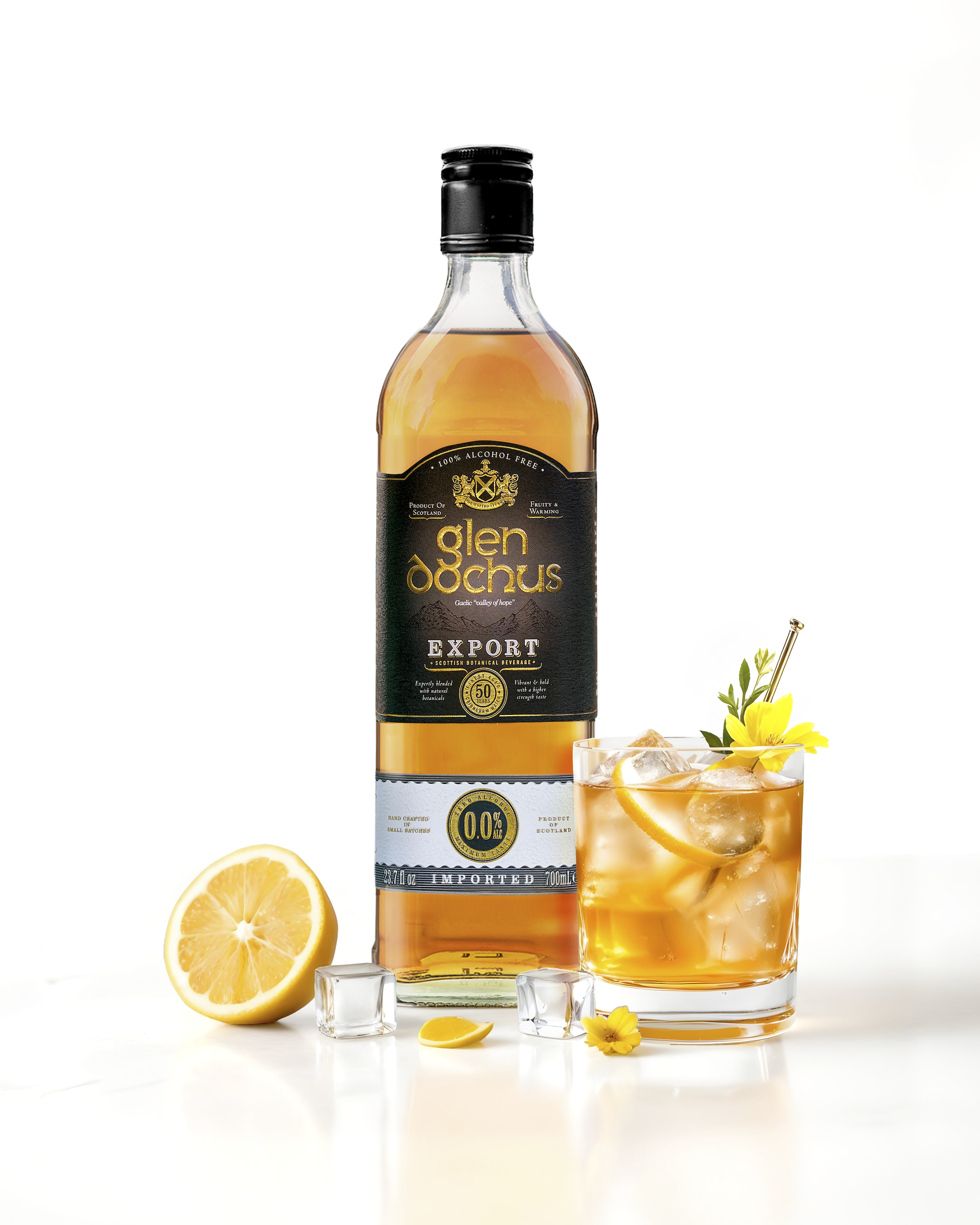
The brand was created to have an identity that felt familiar, expressive and distinctly Scottish — a homage to the majestic landscapes and distinctive Cairngorm waters referenced throughout the design's architecture. Typography, colour and texture were drawn together to feel handcrafted rather than manufactured, echoing the natural forms of glen, loch and mountain. Every mark within the identity nods to the country's rich visual heritage, giving the brand a sense of provenance that feels lived-in rather than invented.
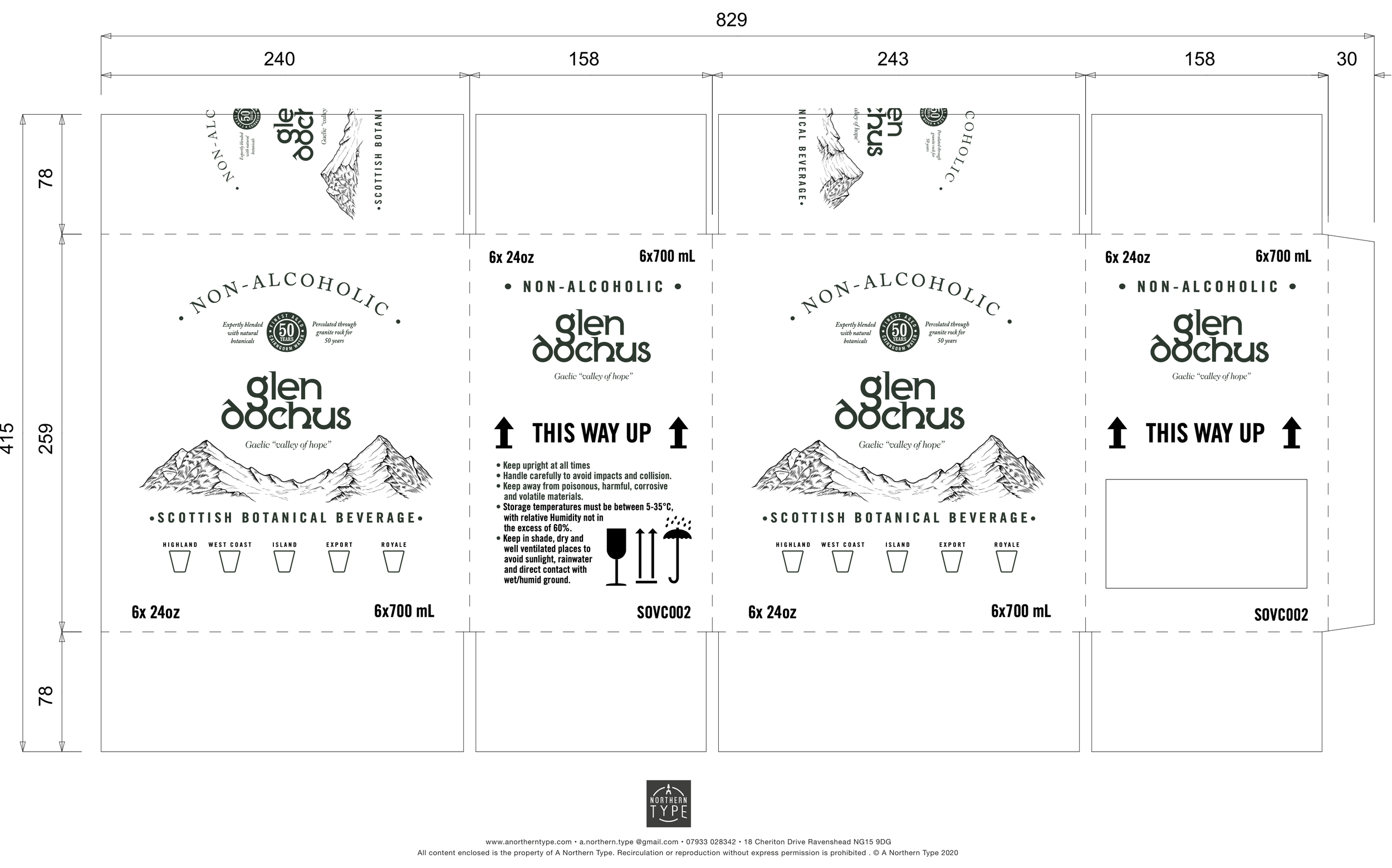
The brand aesthetic is premium, Scottish and sensory, echoing the experience of visiting Scotland's varied and stunning scenery — the hush of mist over still water, the earthy scent of heather and peat, the clarity of mountain air. Each blend's unique flavour profile and crest capture the lore and spirit of the land, with individual crests drawing on a long heraldic tradition to give every expression its own identity. Together, they build a collection that feels less like a product range and more like a series of expressions within the same landscape.
“Each blend's unique flavour profile and crest capture the lore and spirit of the land”