
Everything is Pukka…
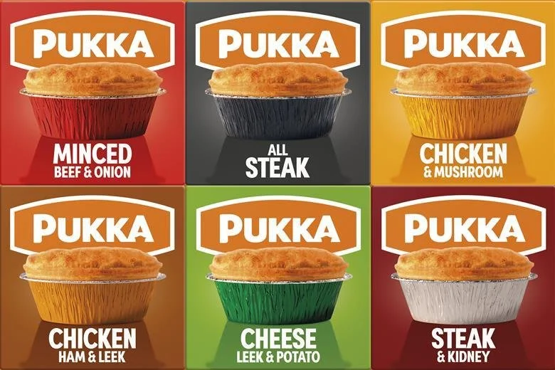
Stereotypes aside, it's fair to say I like a pie — so the new branding for Pukka Pies piqued my interest.
The new look is stripped back. The pie sits centre stage, very much the hero, with the enlarged brand mark taking up the top third and clean white sans serif type popping out of the pie case shadow. It's clear and confident without losing the heritage of that Pukka orange.
Colour does the heavy lifting, sharpening your read of the product and giving it real appetite appeal. Tasty.